Showing posts with label bedroom. Show all posts

Tuesday, September 24, 2013

a purposeful night stand.

clockwise top left: west elm / target / society6 / stack of books / 

It feels like every night stand photo I come across these days are completely chock full of accessories. To the point where if you wear glasses (like I do) you wouldn't be able to set them on it as you settle in for the night. In my opinion, night stands should be part function, part decoration. Opt for dual-purpose accessories to keep the table top pretty but purposeful.

tip: Hang colorful artwork behind the night stand at the same level as the lamp. This will save coveted table space while adding more substance to the overall composition.

Thursday, April 5, 2012

seeing red. the right way.

With today being the Reds AND Indians home openers, I thought it necessary to pay homage to two teams I hold close to my heart. Between my brother being named after Pete Rose, my parents having owned a baseball card store (mmhmm... Gateway Cards) and my brother playing it all his life (he now coaches high school ball in Orlando) I can easily I was born and raised to love the sport. I've met both Manny Ramirez and Charles Nagy (both held signing sessions at my parents store) and my dad even helped Manny find a place when he first moved to Cleveland! I tell you, it's in my blood. Which works out perfectly for my boyfriend who is a Cincinnati Reds DIE HARD.

So what the heck does all of that have to do with anything I post up on here? The color red that's what. A pretty, vibrant color to use as an accent. As long as you know how. Here are some tips to steer you in the right direction.

1. When in doubt, add a chair.
 A simple update like a paintied chair can help break up a neutral palette.


2. Or a hutch.
Painting a piece of furniture red creates a "pop of color" (thank you, mom) regardless of the piece.


3. Or fabric.
I'm not a fan of painting an entire wall red. I think it's because I like to switch things up a lot. So instead, I opt for things like fabric and furniture that you can move in and out of a space depending on the color scheme.


Whatever the accessory, just be sure to keep the color in small doses. The more you use as an accent, the more dramatic the color will look. Happy opening day!!

Wednesday, March 14, 2012

jewelry corner vignette.

One of most intriguing parts of interior design is the styling. Whether it's a dresser, vanity, shelf or entryway table, I'm mesmerized by how these tiny spaces are brought to life. A special moment set aside for your enjoyment. A little story on resting on top of your [insert piece of furniture here].


For the sake of simplicity, let's call these things vignettes. Small enough to glance over yet big enough to make or break a room's design. They're the spots in the room that suggest character, personality and tone. Get it? Good.

So how the heck do you create a gorgeous vignette?

This is what I'm hoping to figure out over the course of this Wednesday series. The goal is to take little areas within my own home, determine what's working and fix what's not.

Now, I'm not trying to discount styling as a profession. In fact, I believe there's a definite art to styling that you either have or you don't. This is why magazines like Real Simple, Elle Decor and House Beautiful  have their very own interior stylist(s) for photo shoots. Ladies like Emily Henderson, Clair Wayman, Megan Morton - y'all are my heroes.


Professional career path aside, isn't there a way the you and I's of the world can at least improve upon this talent? Aren't there a few tricks we could use to disguise our lack of expertise?

experiment #1: my jewelry corner

Here's the before. Unbalanced color and proportions, no obvious focal point and a little stagnant.


And the after. I worked on balancing the colors and proportions while at the same time creating a focal point that would move the eye across the entire vignette.  Gold was added to the shelf by hanging a small frame which also added some subtle height. I removed the large picture below the hanging jewelry to try add focus.  Greenery and wooden accents were added to the dresser to breakup all the white and continue moving the eye across the space. It's a little busy but I kind of like it that way since it's a jewelry corner. Maybe my next challenge will be minimizing accessories.

What does everyone think?


Wednesday, September 21, 2011

Going no headboard.

I'm continuing the headboard-less conversation I started up in yesterday's post. In my opinion, headboards should only be used if you want your bed to be the focal point or need some visual interest within your space. This just happens to be the case in most bedrooms. Mine, not so much.

Having a wall of frames and a busy and brightly patterned duvet, I didn't want to draw any more attention to my bed then necessary. I think the end result may have been different if I could have painted the walls but, since I had to keep them white (thanks, landlord), I was forced to think of ways to add subtle forms of visual interest while keeping the room design from being overkill.  In the end, not having a headboard helped balance the dramatic features and blend the various parts of the room's design.

For those with a similar issue, here are some other images to help lead you to a solution. Please feel free to contact me with questions!

The brightly colored wall and layered patterns speaks for itself.

This room was one of my inspiration rooms. I love it to pieces.

The layers of pillow and color almost acts as a headboard but keeps the polka dot wall the primary focus.

Another one of my inspiration rooms. Thank you Emily Henderson for this lovely space.


Or you can always do the window thing (also discussed in this post).
It's a great way to accentuate structural detailing or add some height.

Tuesday, September 20, 2011

Must. Stop. Changing. Bedroom.

Man, bedrooms are tough. Especially when trying to stay away from that matchy-matchy bed-in-a-bag look. As it stood a few weeks ago, I made the decision to consider my bedroom complete minus a couple of big purchases I can't afford right now (hello, flat screen TV). Posted here, I thought I had nailed what should be placed above my headboard and perfected the look I was trying to hit.

And then I took another look.

I started wondering why I was so set on having a headboard.  The dark rod iron felt heavy and looked all smashed up against the corner. And, the more I thought about it, I realized that any headboard would look smashed if your bed is in a CORNER (duh).

Then I started noticing all of the square objects around the space. And suddenly grew extremely tired of chevron (it's EVERYwhere). And felt like there were enough pictures in the space (hello photo WALL).

But something still needed to be up there otherwise it looked too unfinished.

So I can up with this (hey, Ruby).


And here's the before for comparison.


See how it opens up the space and looks so much less crammed? It's simple, to-the-point and subtle. Honestly, I got really lucky with finding the accessories - the 1950's Eames-style shelves on eBay ($15) and the plate at the Goodwill on Beechmont ($3). They provide texture, balancing the busy pattern on the duvet without adding more color to the mix. Plus, I think they blend better with my wall o' frames.

 I chose to position the display off-center to avoid looking formal and making it seem more functional - almost treating the shelves like an extension of the nightstand.


You'll notice I also added two throws to create additional layers and break apart the big block of pattern. The navy adds a more masculine touch while keeping the bed grounded. I'm much happier with this end result vs. the previous one and can't wait until I save enough for a new curtains and rods.

What do you think of the change?


Monday, September 12, 2011

Exposed brick makes me smile.

I've been crushing hard on rooms with exposed brick since, well, ever. But after searching for inspirational pics during the bedroom redo extravaganza (which I'm changing up AGAIN btw), the crush grew even larger than I'd ever imagined. So much so that I think I'm going to make it a requirement the next time I'm on the apartment hunt. Along with a porch, good water pressure and a claw foot tub.

And let me just tell you, fantasizing about things that you don't have, really helps get things done and find solutions for the things you are working with. In other words, apartment redecorating project, you are put on hold again.

Almost used as an accent wall to break up the white on white in this bedroom.
Natural wood side table used to balance the exposed brick on the opposite side.

This is my absolute DREAM bedroom.
The worn white paint and loads 'o pattern makes my heart go pitter patter.

Painted white in the bedroom makes it more subtle but still enough of a statement. 
Requires little artwork for depth and visual interest for the brick wall to still pop.

I love how they used the exposed brick wall as a backdrop for artwork and book collection.
Creates a raw composition that makes the living room feature a bit more casual.

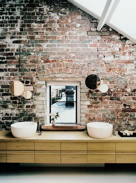
Love the juxtaposition of modern bathroom accessories and fixtures with an old, chipped brick wall.
Adds depth to the space without it looking old, out of date or drab. 

Having brick in an entryway sets a casual tone for the rest of the home.
Not too excited about the wood to tile cutoff on the floor but the brick does a nice job at keeping the eye upward.

This kitchen makes me want to learn how to cook.
The white keeps the kitchen looking pristine and the window set in the brick helps let light in and offers great reflection.

The painted white in this kitchen capitalizes on the brick's texture but keeps the space looking fresh and clean.
Minimal accessories add a modern yet functional touch.

Monday, August 29, 2011

Bedroom mission complete(ish).

And my bedroom is complete(ish)! The (ish) being replacing the curtain rods with the ones in the family room, the taupe curtains with darker brown one and the ugly box TV with a flat screen. Since these all require a budget I don't have (and won't have) for awhile, I am officially declaring the bedroom as completed as it can be.

Here are the highlights:


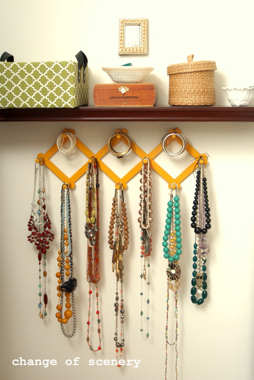
The accessory wall: The wall was in desperate need of some color and just overall life. Life was given by moving my lady artwork underneath the necklace rack, painting the necklace rack the same marigold color as the nightstand and adding a green patterned box for holding bracelets to the mix. This helped balance the yellow and green on the opposite side of the room (the bed) and minimized the amount of white space the wall contained. The TV replacement will eventually help alleviate some of the excess bulk on the wall and, depending on the size, I may add something to fill in the gap between the closet door molding and top of the TV and shelf. We'll see though - I'm kind of liking the simplicity of it as it stands now.


The dresser wall: Majority of the dresser wall stayed the same because I'm IN LOVE with it. That is, after I stained the dresser a darker walnut color. I hate to say it but I literally slapped some pre-conditioner on there, followed it up with the stain and just hoped for the best. Looking back, I probably should have incorporated a little precision and planning to the process but am thankful at how incredibly awesome it turned out anyway.

I did however add a RENS rug which I've been lusting after since what seems like 2002. The addition added a sense of warmth and helped cool the floor which, in turn, helped balance the white walls, mirror and chair. 


The bedroom wall: The lady artwork was a little too big and a little too bland to be above the headboard. After relocating it to the accessory wall, the headboard wall was definitely too blank and screaming for some pattern and color. Not wanting to add another picture, I opted for some canvas paintings of a larger chevron pattern to balance out the softer pattern on my duvet cover and the rectangular shapes of all of the frames. The hint of yellow added helped frame the bed and the softer taupe color actually helps keep my current curtains from looking like sore thumbs.
On the picture wall, I left a few frames their original color to add some visual interest and expanded slightly to include some pictures from my last couple of vacations along with some ornate picture frames I sprayed in a high gloss white.

Overall, I am loving the way my bedroom looks. Of course I wish I could restain the floors and paint the walls but, working with what I have, I think I successfully turned the space into the relaxed, eclectic setting I was looking for.  

Want to know how I made the artwork? Tutorial coming tomorrow!

Tuesday, August 23, 2011

How To: yellow nightstand

Remember this ugly Craigslist purchase? And how I said I loved the lines, hoped it was real wood and couldn't wait to stain it? And then how I sanded off the paint only find a veneer top (side table FAIL post here)? Huh? Remember all that?


Then do you remember seeing that little bit of sunshine just to the right of my bed (in the progress update post here)?

Now what if I told you ugly and sunshine were the same nightstand, only refinished?

Because they are. And look how pretty she (yes, she) is! I mean, completely adorbs, right?!?


So how did I do it? A complete how-to below. Enjoy!

Step One: Sand off the finish.
Now, keep in mind that I was originally planning to stain the table so the sanding pics below are a little extreme. For painting, you only need to take off the finish (read: shiny part) and smooth out any bumps, scratches or chips the surfaces may have. If you have a sander (recommended), you should be done in a couple hours depending on the amount of surface damage and stubbornness of the finish.

Now long did the process shown in the pics below take me? Two days of stripping (totally a gross process, I don't recommend) and about a day of sanding. Uh, huh. Yeah. FAIL.


Step Two: Prep and prime your piece.
Whether a couple of hours or three days after you finish the sanding (sigh), be sure to wipe off the piece REALLY well, removing all sawdust residue and excess finish. I recommend using either tack cloth (it's sticky so wear gloves) or a rag very soaked in mineral spirits. From there, let dry completely (about 15-20 minutes) and prepare yourself for priming.

To prime, I used a can of white spray primer and sprayed just enough to cover the entire surface with a very thin coat. Meaning, you don't have to spray the surface to the point where you don't see any of the wood/paint underneath, just so that the new paint has something to adhere itself to. Make sense? Let dry completely (read the instructions) before applying your actual color.


Step Three: Apply your color.
Once you've finished priming and let dry, continue to apply layers of thin paint until completely covered. In this case, I used two cans of high gloss, Marigold I purchased at my local Ace Hardware. This is the point in the process where you need patience. Apply a thin layer, letting go of the fact that you may be able to see some white coming through still. Wait 10 minutes. Apply a thin layer, and so on. I think this took me about 3 coats and maybe an hour to complete.

Step Four: Apply your finish.
Because this was a table that would be used to hold things like cups of water, I wanted to apply a polyurethane finish to protect the paint and make a little more durable to wear and tear. I waited 24 hours until fully dry (again, read the instructions!) and painted on a thin coat of satin polyurethane, lightly going over each section with a clean rag (read: ripped up t-shirt) to prevent drips and inconsistencies.

Always apply a finish to painted pieces that you need to be durable (i.e. kitchen cabinets, coffee tables, etc.) to prevent color transfer and showing general wear and tear.


So here's where I netted out. Cute, but I thought it was missing something. Then it came to me.

Step Five: Add a handle (optional).
I got this one at Hobby Lobby for $2 thanks to a 50% off sale. Woot woot!

To do this, find the center of the door, measure outward, mark and check to see if the two points are level. From here, drill holes using a drill bit that's slightly larger than the screws you're using to affix the handle.

Before drilling, make sure to double and triple check all of your measurements. I got cocky, only measured once and ended up drilling holes that were completely, 100% not level. Luckily, I was able to rig it so that it looks even now, but I'll eventually have to putty the hole up, respray the door and redrill the second hole.

Ugh.

But isn't she so pretty?!?!?!