Showing posts with label flickr. Show all posts

Wednesday, October 26, 2011

workspace layout and artwork.

As mentioned in a previous post, the next step in my workspace revamp was to "try on" both options. I was moving, dragging, pulling and pushing. Good thing I bailed on working out after work.

First up, the good on paper option.


Looks like a decent option right? Let's check it out real-life. 


Mind you, no matter what layout I try on, the space is still going to look ugly because it's not accessorized properly. But aside from the accessories, this layout still isn't working for me for a couple of reasons:
  • the hutch ends up looking crammed in the corner
  • the furniture still looks like it's there to fill space
  • the sewing machine now looks like a place for timeout 

Second, the alleyway option. 


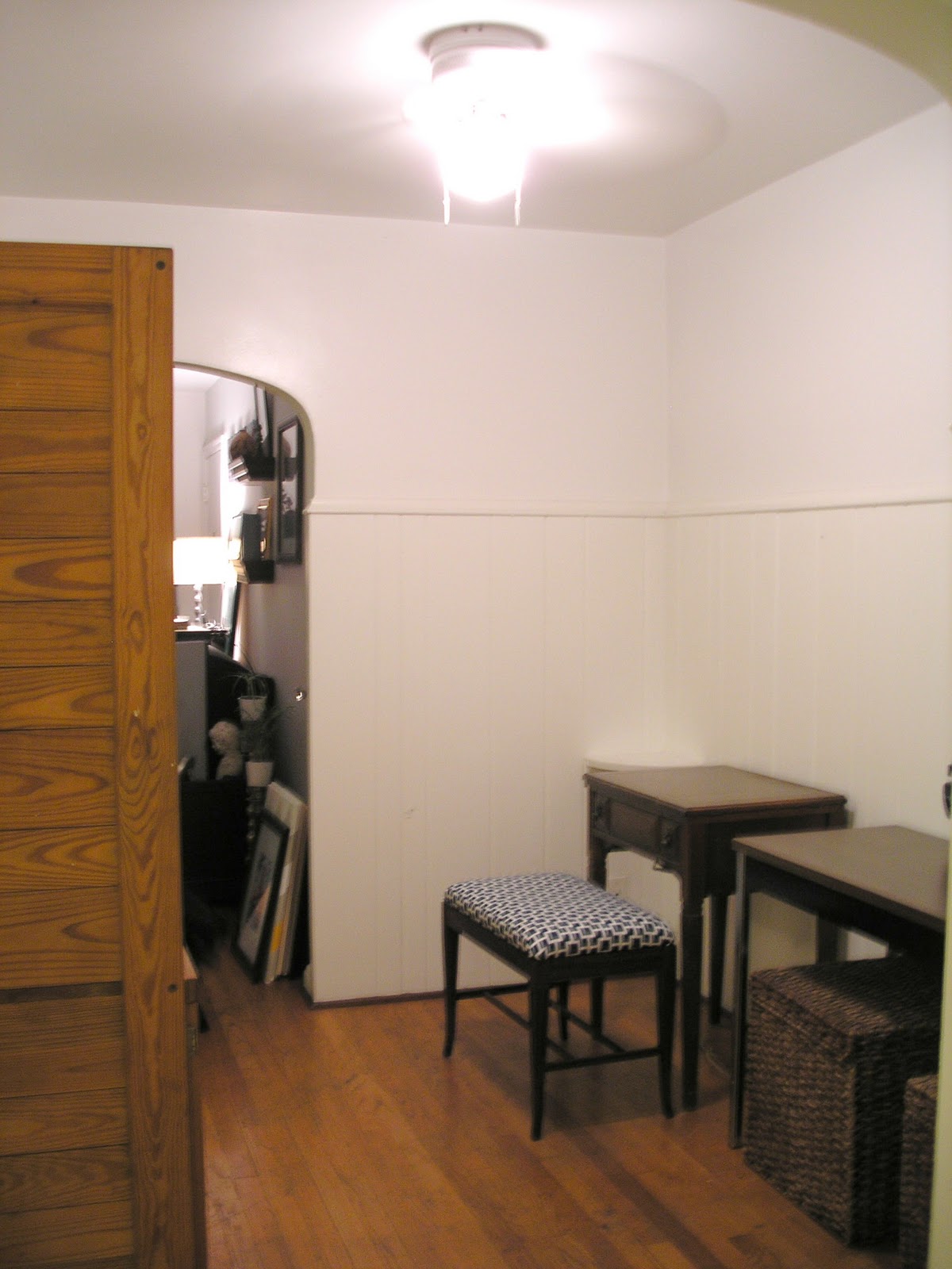
This one looked kind of meh. But after taking a look at the real deal, it started growing on me. 


I like the long row of working space and the opportunity for hanging an awesome photo/inspiration wall that will end up adding height and visual interest. The hutch completely blocks the side of the fridge and makes the space feel much warmer and less forced. I'd like to get some different seating as these rattan cubes are currently my coffee table and paint them and the legs of the desk all different - but complimentary - colors. 

A couple of things that are still driving me nuts:


I mean, what is this? In the corner of the room for what I think used to hold a home phone, I wish I could grab a sledge hammer and remove it. 


This is the only outlet in the space and it happens to be in the middle of the main wall. I need to keep my router, printer and sewing machine all plugged into there so I needed to come up with some kind of solution. So I tried my new desk organizer


Well that looks a little awkward all IN THE MIDDLE of the desk . So, imagining a bunch of other pictures hung on the wall, I tried leaning a canvas up against the wall to cover. And success! While I'm way, way, WAY over the chevron, I think the canvas lean seems much more natural and takes up much less desk space. Plus, I just so happen to have plenty of options on hand. 


So what's the whole wall display going to end up looking like? Here are some options I pulled from pinterest to help decide. 


Thursday, September 15, 2011

Picture perfect work spaces.

Aside from a few odds, ends and a couple of big ticket items (hello flat screen TV), I have my bedroom and bathroom pretty much wrapped up and nailed down. So what's next you might ask? My make-shift craft/work area! In this work space / home office / whatever you want to call it, I'm looking for somewhere to:
  • complete projects/crafts (read: large workspace)
  • hang inspiration pictures, moodboards and other random finds
  • store all my crafting gear
  • store Lois, my grandma's old sewing machine
Since I'm limited to a small, narrow breakfast nook, I'm going to have to get creative with the spacing challenges and furniture arrangement. And, since it's also kind of part of the kitchen, I want to figure out a way to separate the two spaces since they will be serving such different purposes. As of right now, I'm too embarrassed to take any before pictures (my place is A MESS) so I'll offer up some inspiration pics I've been storing to help pull the space together.

(clipboard idea organization method and tons o' drawers underneath)

(color palette and inspiration board)
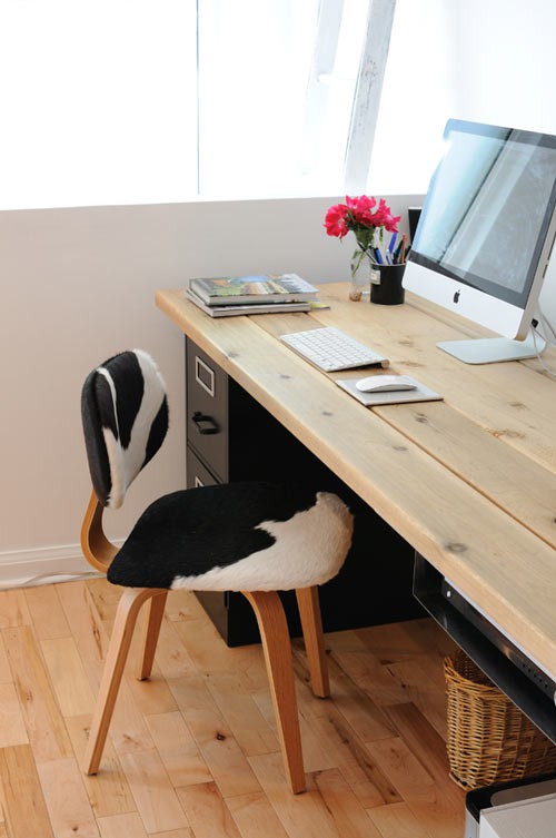
(faux cow hide seat cover and make-shift desk)

(rug and fabric chair)

(corner shelving)

(LOVE the bright red desk and turquoise cabinets underneath)

(awesome idea to use a vintage bed frame as an inspiration board)

Monday, September 12, 2011

Exposed brick makes me smile.

I've been crushing hard on rooms with exposed brick since, well, ever. But after searching for inspirational pics during the bedroom redo extravaganza (which I'm changing up AGAIN btw), the crush grew even larger than I'd ever imagined. So much so that I think I'm going to make it a requirement the next time I'm on the apartment hunt. Along with a porch, good water pressure and a claw foot tub.

And let me just tell you, fantasizing about things that you don't have, really helps get things done and find solutions for the things you are working with. In other words, apartment redecorating project, you are put on hold again.

Almost used as an accent wall to break up the white on white in this bedroom.
Natural wood side table used to balance the exposed brick on the opposite side.

This is my absolute DREAM bedroom.
The worn white paint and loads 'o pattern makes my heart go pitter patter.

Painted white in the bedroom makes it more subtle but still enough of a statement. 
Requires little artwork for depth and visual interest for the brick wall to still pop.

I love how they used the exposed brick wall as a backdrop for artwork and book collection.
Creates a raw composition that makes the living room feature a bit more casual.

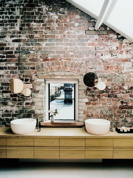
Love the juxtaposition of modern bathroom accessories and fixtures with an old, chipped brick wall.
Adds depth to the space without it looking old, out of date or drab. 

Having brick in an entryway sets a casual tone for the rest of the home.
Not too excited about the wood to tile cutoff on the floor but the brick does a nice job at keeping the eye upward.

This kitchen makes me want to learn how to cook.
The white keeps the kitchen looking pristine and the window set in the brick helps let light in and offers great reflection.

The painted white in this kitchen capitalizes on the brick's texture but keeps the space looking fresh and clean.
Minimal accessories add a modern yet functional touch.

Thursday, September 1, 2011

An Emily Chalmers and Francesca Herrera love sesh.

I couldn't decide which one of these lovely ladies to write about first so I'm just going to write about both. Despite having two extremely different styles and two entirely different set of rules, these two designers are the latest to have caught my eye.

Emily Chalmers
If you can't tell by the pictures below, Emily appears to have just as big of an obsession with chotchkies as I do. But it's her ability to place, choose and feature these random tokens of happiness that sets her apart from the rest. I'm way into the way she layers pattern, combines color and picks the most interesting furniture shapes for her spaces. She's a true bohemian with a beautiful, eclectic aesthetic and new book out called Modern Vintage Style. To summarize, lady has it going on.


Introduced through a Made By Girl post, I actually like Frances for exactly the opposite reasons I like Emily Chalmers. For example, Frances describes her approach to interiors using words like "understated", "polished" and "refined". She has the ability to edit and her spaces are always bright, full-of-light and have just a touch of quirkiness. Kind of like the girl version of Thom Filicia. And while I love appreciate the kitsch of Emily's style, I get the want to keep rooms from looking like you purchased everything at an estate sale. Cleaning it up a bit and making choices as to what should be displayed gives you more of that balanced, pulled together, all-grown-up kind of look. With great style combinations, timeless furniture choices and very well coordinated patterns, Frances is definitely someone to keep an eye on.


all images from Francesca's site

Thursday, August 11, 2011

Good old blue.

Oh, blue.

One of my favorite colors to work with and probably THE most versatile color out there. I mean, if I could paint my walls, I can easily commit to saying that at least 4 of them would be blue. You can dress it up, dress it down, make it look vintage, make it look victorian... whatever.

But picking a hue can be tricky. Personally, I'm drawn to the more turquoisey hues with real taupey undertones. But then again I also like really pale blues - so pale that they can almost be mistaken for an icy white. So how do you choose the right hue?

Pick a tone. For calming more serene rooms, go with a softer blue with gray undertones. Energetic, entertainment worthy ones - choose an aqua or a turquoise that's really saturated and bold.

Choose multiples. Blue is one of those colors you can get monochromatic with while still adding depth and visual interest within a room. The key is keeping the saturation level consistent while switching up the overall hue. Take the first room shown as an example. Each blue in the space is very bold and vibrant however one's aqua, another is teal and another colbalt. All blues are different but at the same time compliment one another because they are all consistent in saturation. Make sense?

Use as a neutral. Blue is just one of those colors that creates a fantastic backdrop for other colors to pop off of. It's just one of those colors that seemingly matches everything you put next to it and really the only way you can go wrong is by choosing a country, powder blue. Try getting a statement piece in a rich blue hue or paint an entire room your favorite shade and then accessorize with completely different colors like orange, green or even red.

Go geometric. Blue is also one of those colors that looks really good in a pattern. Especially more angular or symmetrical ones like chevron, honeycomb or greek key patterns. An easy way to add visual interest without going over the top.