Showing posts with label desire to inspire. Show all posts

Sunday, January 13, 2013

living room inspiration

modern eclectic: mixing the new with the old in a way that feels collected, timeless and balanced

This is the style our entire home is decorated in. And, while it's the most casual, it's also the most difficult to get right. Which is why I'm constantly redecorating. And why our living room looks borderline like a garage sale. And why I can't pick a freaking side table or a rug to save my life. I think I have the accessories and furniture placement down, I just need a couple of things to pull the whole look together. 

The Musts: Table has to have enough room for multiple beverages, plates of food and magazines. Rug needs to go along with the dining room rug and have enough visual interest to breathe life into the drab couch and chair. 

I'll show you more about what I mean tomorrow, but for now, I'm just collecting ideas from the interwebs.


via bhg

Katie Ridder via the peak of chic


Wednesday, November 9, 2011

rooms i'd like to live in.

I am so entranced in this imaginary dollhouse world that I can't help but day dream about dream houses (or in my case, apartments). ALL. DAY. LONG. So as an attempt to combat this gray, rainy day with thoughts of princess castles and marshmallows, here are some rooms I've been collecting (pinterest again, duh) that make me want to do a happy dance.

And don't worry, if you like it too we can just live there together. Sharing is caring.

Enjoy!
a perfect mix of cluttered chaos. the patterns and teal and books keep it cozy.
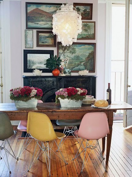
the white fireplace and chandy keep this room from looking too chaotic.

if this was the guest bedroom I got to hang out in when i visited,
I would be visiting a lot more often.

love the candles, love the caddy, love the chair. a fantastic little retreat to relax in.

this makes me want to read day in and day out. the HUGE window is outrageous,
the patterns lived-in and the book shelf loaded. I hope it's of James Patterson -
because then I'd never leave!

this outdoor area is unreal. not sure how everything stays dry and clean but,
since I'm technically in the land of make believe, I will ignore any questions regarding functionality.

I love the wood accents and the yellow couch.
I don't know why but it makes me want to sip wine, listen to music and gossip all night.

ok, I really need to do this. it's cute, it's functional, it just needs to happen.
maybe on my bookcase in the living room?

this is another must do - although I feel like it's mocking me right now.
Sadly, I finally had to put the little Ikea palm tree plant to rest. Plants: 0 - Kate: 1
RIP little guy.

this is Ellen Pompeo's kitchen that I have been in love with ever since it was
featured in Elle Decor. The open cabinetry, the super-size fridge, the georgous
picture, the giant stove for me Jim to cook on... sigh.

I absolutely love bathrooms or kitchens that have regular furniture in them
vs. the sterile, waterproof, kitchen- or bath-only pieces we so
regularly see. This bowl sink and vintage dresser vanity make me want to hug someone.

this is the cutest kid's painting / family wall I've seen yet.
Filled with black and white, old photos and finger paint masterpieces,
I think I would stare at it nonstop.

Wednesday, October 26, 2011

workspace layout and artwork.

As mentioned in a previous post, the next step in my workspace revamp was to "try on" both options. I was moving, dragging, pulling and pushing. Good thing I bailed on working out after work.

First up, the good on paper option.


Looks like a decent option right? Let's check it out real-life. 


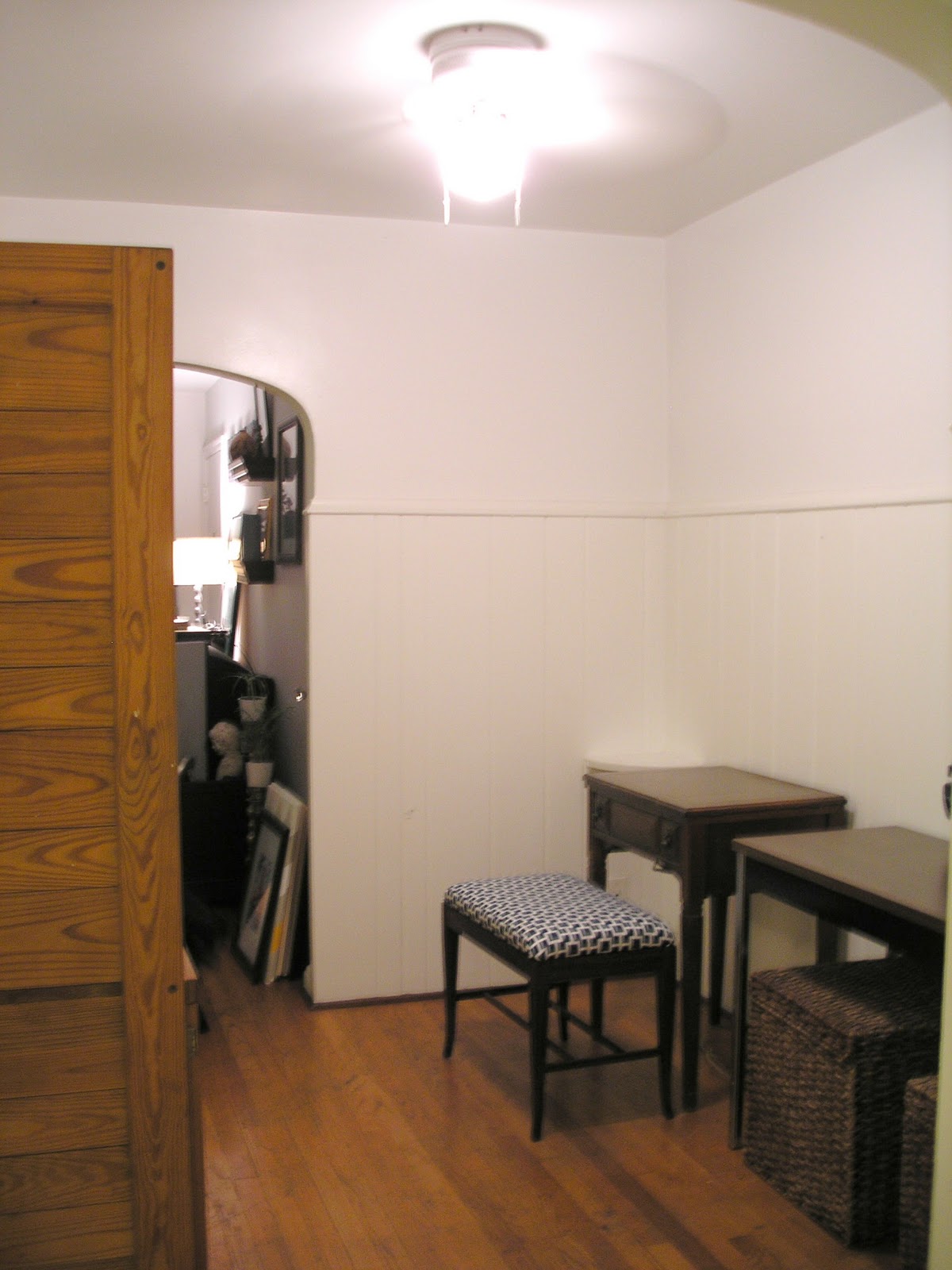
Mind you, no matter what layout I try on, the space is still going to look ugly because it's not accessorized properly. But aside from the accessories, this layout still isn't working for me for a couple of reasons:
  • the hutch ends up looking crammed in the corner
  • the furniture still looks like it's there to fill space
  • the sewing machine now looks like a place for timeout 

Second, the alleyway option. 


This one looked kind of meh. But after taking a look at the real deal, it started growing on me. 


I like the long row of working space and the opportunity for hanging an awesome photo/inspiration wall that will end up adding height and visual interest. The hutch completely blocks the side of the fridge and makes the space feel much warmer and less forced. I'd like to get some different seating as these rattan cubes are currently my coffee table and paint them and the legs of the desk all different - but complimentary - colors. 

A couple of things that are still driving me nuts:


I mean, what is this? In the corner of the room for what I think used to hold a home phone, I wish I could grab a sledge hammer and remove it. 


This is the only outlet in the space and it happens to be in the middle of the main wall. I need to keep my router, printer and sewing machine all plugged into there so I needed to come up with some kind of solution. So I tried my new desk organizer


Well that looks a little awkward all IN THE MIDDLE of the desk . So, imagining a bunch of other pictures hung on the wall, I tried leaning a canvas up against the wall to cover. And success! While I'm way, way, WAY over the chevron, I think the canvas lean seems much more natural and takes up much less desk space. Plus, I just so happen to have plenty of options on hand. 


So what's the whole wall display going to end up looking like? Here are some options I pulled from pinterest to help decide. 


Monday, October 24, 2011

floorplanning a workspace.

First off, thanks again to A-Line Magazine for letting me offer up some advice on refinishing. It was a really fun assignment and an easy way to prevent project procrastination.

Speaking of project procrastination, I'm still up in arms about what to do with my craft room/nook/workspace. I've actually decided to call it a workspace so it can accommodate whatever new project I put on my plate next. Commitment crisis, averted.

Now that I have the name down, I started picking apart the floorplan in hopes of uncovering some super easy solution or idea for pulling the whole space together.

Here is how it's setup now.


The triple doorway off to the left leads to a bathroom (top), bedroom (side) and pantry (bottom). I placed my desk on the tiny wall next to my bathroom door which spills into the kitchen entryway and blocks the side of the fridge. The hutch and Lois the sewing machine are right next to each other, leaving room for the opening and closing of the top. Ruby's area is in the small corner and seems more forced than planned.

Largest area of dislike? When you look at the space from the living room (open space on the right wall), it looks more like a garage sale than a room. There's no area of focus and everything is stained wood. It's just so blah.
After working through some options, I gave myself two to pick from.


Option 1 is all about making the space a room. I moved the hutch to the side of the pantry, helping out the view from the living room. I switched the desk and Lois, thinking of adding an "inspiration wall" to block the fridge and creating an easier flow in terms of functionality. I'm still not happy about the dog bowl and toy basket placement - I think moving them next to Lois would be a better option.
In this case, I would paint the hutch, drawing attention away from the kitchen. I would then refinish the sewing machine and leave the top of the desk the same dark wood color for balance.


I like this color combination as inspiration for refinishing the hutch. The blue will tie into my living room and the yellow will help blend the kitchen tile. It might be just a tad too "antique" for me though. Probably go a deeper blue and a little lighter on the distressed look.


The second option plays off the narrowness of the space, making it more like an alleyway than an actual room. This will draw less attention but still keep the plan of refinishing the hutch blue. The bench along with some other seating options can be pushed neatly underneath for storage while adding some pops of color to that side of the space. I kind of like the hutch completely blocking the fridge, acting like it's just a part of the wall. The hutch would then create a Ruby area (like she needs another one) that would house her food bowls and always-empty toy basket.

In this case, I'd probably add a hallway-sized rug to bring the two sides together.

The plan is to head back to my place after volleyball tonight (USA! USA!) to try out both arrangements and report back.

The good news: I have a direction for the hutch.

The bad news: I still haven't a clue how it's going to turn out.

Here are some more ideas I've collected (Pinterest! Pinterest!) to bring the whole space together.