Speaking of project procrastination, I'm still up in arms about what to do with my craft room/nook/workspace. I've actually decided to call it a workspace so it can accommodate whatever new project I put on my plate next. Commitment crisis, averted.
Now that I have the name down, I started picking apart the floorplan in hopes of uncovering some super easy solution or idea for pulling the whole space together.
Here is how it's setup now.
The triple doorway off to the left leads to a bathroom (top), bedroom (side) and pantry (bottom). I placed my desk on the tiny wall next to my bathroom door which spills into the kitchen entryway and blocks the side of the fridge. The hutch and Lois the sewing machine are right next to each other, leaving room for the opening and closing of the top. Ruby's area is in the small corner and seems more forced than planned.
Largest area of dislike? When you look at the space from the living room (open space on the right wall), it looks more like a garage sale than a room. There's no area of focus and everything is stained wood. It's just so blah.
After working through some options, I gave myself two to pick from.
Option 1 is all about making the space a room. I moved the hutch to the side of the pantry, helping out the view from the living room. I switched the desk and Lois, thinking of adding an "inspiration wall" to block the fridge and creating an easier flow in terms of functionality. I'm still not happy about the dog bowl and toy basket placement - I think moving them next to Lois would be a better option.
In this case, I would paint the hutch, drawing attention away from the kitchen. I would then refinish the sewing machine and leave the top of the desk the same dark wood color for balance.
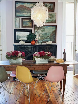
I like this color combination as inspiration for refinishing the hutch. The blue will tie into my living room and the yellow will help blend the kitchen tile. It might be just a tad too "antique" for me though. Probably go a deeper blue and a little lighter on the distressed look.
The second option plays off the narrowness of the space, making it more like an alleyway than an actual room. This will draw less attention but still keep the plan of refinishing the hutch blue. The bench along with some other seating options can be pushed neatly underneath for storage while adding some pops of color to that side of the space. I kind of like the hutch completely blocking the fridge, acting like it's just a part of the wall. The hutch would then create a Ruby area (like she needs another one) that would house her food bowls and always-empty toy basket.
In this case, I'd probably add a hallway-sized rug to bring the two sides together.
The plan is to head back to my place after volleyball tonight (USA! USA!) to try out both arrangements and report back.
The good news: I have a direction for the hutch.
The bad news: I still haven't a clue how it's going to turn out.
[http://frenchbydesign.blogspot.com/search?updated-max=2010-05-26T07%3A41%3A00-04%3A00&max-results=20]


Quality posts are important to attract the visitors to visit the web site,
ReplyDeletethat’s what this website is providing. 온라인카지노