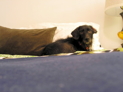
And then I took another look.
I started wondering why I was so set on having a headboard. The dark rod iron felt heavy and looked all smashed up against the corner. And, the more I thought about it, I realized that any headboard would look smashed if your bed is in a CORNER (duh).
Then I started noticing all of the square objects around the space. And suddenly grew extremely tired of chevron (it's EVERYwhere). And felt like there were enough pictures in the space (hello photo WALL).
But something still needed to be up there otherwise it looked too unfinished.
So I can up with this (hey, Ruby).
And here's the before for comparison.
See how it opens up the space and looks so much less crammed? It's simple, to-the-point and subtle. Honestly, I got really lucky with finding the accessories - the 1950's Eames-style shelves on eBay ($15) and the plate at the Goodwill on Beechmont ($3). They provide texture, balancing the busy pattern on the duvet without adding more color to the mix. Plus, I think they blend better with my wall o' frames.
I chose to position the display off-center to avoid looking formal and making it seem more functional - almost treating the shelves like an extension of the nightstand.
You'll notice I also added two throws to create additional layers and break apart the big block of pattern. The navy adds a more masculine touch while keeping the bed grounded. I'm much happier with this end result vs. the previous one and can't wait until I save enough for a new curtains and rods.
What do you think of the change?


I like a headboard, otherwise it looks like there's something missing!
ReplyDeleteRue girl is so cute!