Showing posts with label artwork. Show all posts

Wednesday, February 22, 2012

workspace in progress.

I have to admit, I'm pretty proud of myself. Last weekend, I was crazy productive and started putting together my workspace (finally!). I was focused, determined and confident in how I wanted to pull it all together. Knowing it's a work in progress, I thought I'd share some shots to at least prove there isn't a pile of junk spanning across the entire area anymore. I still need to choose artwork and refinish some of the furniture but I'm really happy with how things are shaping up.

The biggest tip? Make sure to surround yourself with storage, inspiration and things that make you actually want to be there. After all, at the end of the day - it's still a place for work which can keep you from hanging out there.

[canvases are being changed to softer paintings with a lot of white space]
[most of the frames were spray painted white - still toying with whether to paint the two frames white]

[two cork boards on either side of the space for posting]

[canvas on the desk actual hides the power cords and internet]

Like I said, it's still a work in progress. I'm planning to tone down the artwork a lot - keeping the overall composition soft, minimalistic and filled with pastels. I want the environment to be serene yet inspiring. Like all my rooms, I don't want it to look completely pulled together because to me, that's boring. I feel most comfortable when things are a little disheveled and full of personality. Kind of giving off the same vibe as these spaces.


I've been browsing through my new favorite artwork site, society6, for some investment planning and inspiration pieces. The only thing that stinks is that I'm still on the hunt for a site with 4x6 and 5x7 pictures - anyone have any go-tos they're willing to share? Here's are some ideas I have for the artwork so far. 


As mentioned before, I'm also planning on refinishing my desk, the hutch (not pictured) and (maybe) my sewing machine. I have a couple of options up my sleeves but I'm still figuring out how to execute. I also managed to swipe a chair from the side of the road (yep, I'm that girl) that I plan to recover and refinish as well. 

As you can see, I'm headed down the eclectic road again, keeping the clutter balanced and manageable with a lot of white and repetitive shapes and color. I'm still tinkering around but hopefully I can pull together the final look within the next couple of weeks. 

What do you think so far?

Sunday, December 18, 2011

twelve days of christmas: day eight


On the eighth day of christmas, my true love gave to me...

Eight pretty photos.

With the dollhouse pretty much done, I'm finally able to get back to making updates to my little, rented apartment. While it was fun wishing and dreaming and making and faking, it's time to get back to the reality of my 1960's shotgun-style digs and it needing some serious TLC. I know it will never get to the point of being perfect (hello, pink and teal bathroom tile), but I at least want to try and make it as pretty as it can be until I figure out my next move.

So I turn my attention back to the breakfast-nook-turned-workspace. I've adapted the layout so it's way, way, WAY more functional (posted about here) but now sits a lot of blank, white walls. To breathe some life into the tiny, little workspace, I've decided to both purchase and make the featured artwork so the space looks layered, eclectic and full of inspiration. Here are eight (yes, eight) photos that would be perfect for the space.


All I want-to-purchase artwork from 20x200 because I love that site. All artwork I-want-to-reinterpret from pinterest.

The Rest of the Bunch

Sunday, November 20, 2011

faux wild life.

I was cruising around etsy for artwork last night and came across these photographs. The photos are taken by Jeff Friesen via Wild Life Prints and as weird as they are, I kind of love them. The subjects are plastic animals, the background looks to be a dollhouse and the tone hilarious. A real talent for composition, here are some of my favorites (read: buy me these for christmas, thanks).

(p.s. I have this same scrap booking paper in my stash)


Wednesday, October 12, 2011

the little bathroom that could: revamp

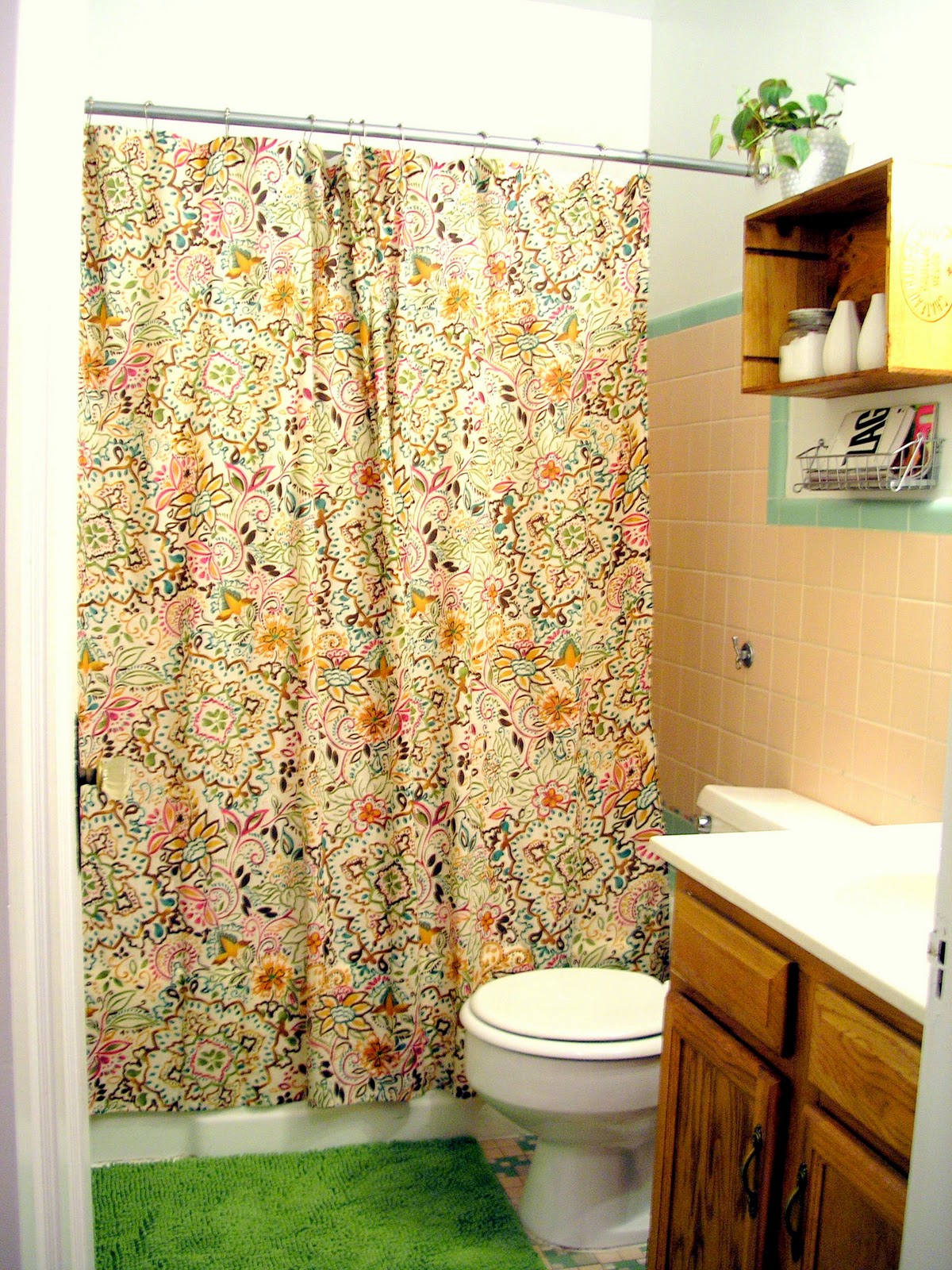
Oh, my bathroom. The little, narrow, poorly designed place I absolutely hate but secretly love all at the same time. Word from the wise: light pink + sage green = absolutely hideous.

At first I thought the best plan of attack was to temper the horrendous color palette with white. The more white the better. White rug, white shower curtain, white, white, white.

Then I came to the realization that I had a dog, with black hair, that liked to shed, shed, shed. Paired with the fact that the space ended up looking more washed out than crispy clean, out went that idea and I was on to something else.


To work with the colors, I ended up pretending the choices were good ones by focusing on the hue vs. the actual shade. I added brighter, saturated, more modern versions of the pink and green, making the space feel warm, cozy and almost fresh. Slowly but surely, the tile started to look more like a plan and less like an eye sore. And with the final additions of busy pattern and lumpy fabric, I think I might just like being in there.

Except when my stomach hurts.

Then it's always bad.


Here are some beautifully photographed afters (thank you, Centsational Girl) to feast your eyes on. Yes, it's definitely not my dream bathroom, but I think it came together as best it could in the end. Highlights include:


[pattern and texture]

[basket of reading material AKA my dad's favorite part of the space]


[refocusing the attention to brighter, prettier accessories]


shopping list:*
$21 shower curtain from Target
$5 wine crate from The Wine Merchant
$2 plant from Meijer
$3 pot from Goodwill
$13 rug from Ikea
$2 basket from Ikea

*everything else was found and collected from my own personal stash of junk treasure.

Monday, September 12, 2011

How to: silhouette bathroom artwork

Brace yourselves. I went a little risque with my bathroom artwork. I felt like I could because the bathroom started looking all pulled together and polished with the wine crate shelf (post here). The added white accessories balanced the drab, ugly tile and lightened up the bulkiness of the wine crate and chunky vanity. I'm still fiddling around with which accessories to display but I plan to mix modern and vintage for an eclectic look with an updated feel. But more on that later.

On the opposite wall, I wanted to hang some larger artwork that mimicked the simplicity of the wine crate and white accessories but added a little humor and unexpectedness. It needed to be water-resistant, couldn't compete with the wine crate shelf display and incorporate a pop of color.

So what did I come up with?


That's right, a silhouette of my dog taking a dump! 

It's weird I know, but for some reason I this it's hilarious the way a dog proudly sits back into a good lean to take a #2. They always seem so uncomfortable and awkward and I can't help but chuckle every time I see one get into the position. Then, while waiting the 10 minutes for Ruby to eventually pick her perfect spot, I got to thinking about how awesome a silhouette of the goofy pose would look in my bathroom. 

So, I putting my pride aside and creepily followed Ruby around the front lawn with my phone waiting for her to do the deed. Then I snapped a million different photos hoping and praying I got one that was usable. Fortunately, a snagged this one. She was so embarrassed.


Next, I grabbed my sketch pad and drew the outline of my little furry roommate so it was large enough to fill the spare 18"x24" canvas I had laying around. I cut out the sketch, traced it on the canvas and mixed the perfect shade of hot pink to fill in the outline.


For the record, I was debating on whether to go hot pink or deep teal. To help make the choice, I decided to pick the shade based on the tile color I hated the most in hopes that it would draw attention away. Obviously, the pink won. 


Overall, I'm really happy with the choice. I think it looks modern, brightens up the space and compliments the wine crate and accessories nicely. Plus it's funny, another way to embarrass my dog and something that, yet again, reminds me not to take anything too seriously.

Next up: dialing up the fabrics. Since the white walls are über stark and the tile is über ugly, my goal is to use texture and color to help blend everything together in a way that makes the bathroom decor seem as cohesive and as pretty as it can be.

Wednesday, August 31, 2011

How to: chevron artwork

Monday, I posted my 97% finished bedroom, including some chevron artwork above my headboard. It filled the empty space, added another layer of subtle pattern and allowed me to distribute some more yellow around the rest of the room. Turns out the project wasn't exactly as easy as I thought it would be but pretty simple nonetheless. Put simply, the more perfectionist you are about it, the longer it will take to complete. Ugh.

Anyway, here's how I did it.

Materials
Two 18"x24" canvas boards
Three bottles of acrylic craft paint in your choice of colors
Level
Pencil
A good, sturdy eraser

NOTE: I ended up using a 2-pack of canvas boards purchased at Michaels. If you go that route, make sure to print off the 40% off coupon from their site, making the total project cost $11.

Step One: measure and grid
Dust off your math skills and bear with me because this part's a little hard to explain. Stand up your canvases so they 24" tall, 18" wide. Then, using your pencil and level, make horizontal lines that are 4" apart. You should have 5 lines, 6 spaces. Then, flip the canvases on their sides so that they are 18" tall, 24" wide and make horizontal lines that are 3" apart. You should have 5 lines, 6 spaces, creating a grid-like pattern on each of the canvases.

Make sense?

For those that want thinner or taller chevrons, you'll need to either increase or decrease the number of lines depending on the desired outcomes (read: do more math).

Step Two: draw the diagonals
Now that you've created a grid, you're ready to build your chevrons. Starting at the top left corner, make a diagonal line across the first rectangle. Move to the next rectangle and, starting where the first horizontal line left off, draw a second diagonal line going the opposite direction in a zigzag fashion. Continue doing this across the entire canvas, move to the next row of rectangles and repeat.


Step Three: start painting
To avoid confusion, start painting with one of your colors, marking which ones to paint ahead of time. Apply 2-3 coats and let dry. Then, move onto your next color, leaving one stripe unfinished for your final color.


Monday, August 29, 2011

Bedroom mission complete(ish).

And my bedroom is complete(ish)! The (ish) being replacing the curtain rods with the ones in the family room, the taupe curtains with darker brown one and the ugly box TV with a flat screen. Since these all require a budget I don't have (and won't have) for awhile, I am officially declaring the bedroom as completed as it can be.

Here are the highlights:


The accessory wall: The wall was in desperate need of some color and just overall life. Life was given by moving my lady artwork underneath the necklace rack, painting the necklace rack the same marigold color as the nightstand and adding a green patterned box for holding bracelets to the mix. This helped balance the yellow and green on the opposite side of the room (the bed) and minimized the amount of white space the wall contained. The TV replacement will eventually help alleviate some of the excess bulk on the wall and, depending on the size, I may add something to fill in the gap between the closet door molding and top of the TV and shelf. We'll see though - I'm kind of liking the simplicity of it as it stands now.


The dresser wall: Majority of the dresser wall stayed the same because I'm IN LOVE with it. That is, after I stained the dresser a darker walnut color. I hate to say it but I literally slapped some pre-conditioner on there, followed it up with the stain and just hoped for the best. Looking back, I probably should have incorporated a little precision and planning to the process but am thankful at how incredibly awesome it turned out anyway.

I did however add a RENS rug which I've been lusting after since what seems like 2002. The addition added a sense of warmth and helped cool the floor which, in turn, helped balance the white walls, mirror and chair. 


The bedroom wall: The lady artwork was a little too big and a little too bland to be above the headboard. After relocating it to the accessory wall, the headboard wall was definitely too blank and screaming for some pattern and color. Not wanting to add another picture, I opted for some canvas paintings of a larger chevron pattern to balance out the softer pattern on my duvet cover and the rectangular shapes of all of the frames. The hint of yellow added helped frame the bed and the softer taupe color actually helps keep my current curtains from looking like sore thumbs.
On the picture wall, I left a few frames their original color to add some visual interest and expanded slightly to include some pictures from my last couple of vacations along with some ornate picture frames I sprayed in a high gloss white.

Overall, I am loving the way my bedroom looks. Of course I wish I could restain the floors and paint the walls but, working with what I have, I think I successfully turned the space into the relaxed, eclectic setting I was looking for.  

Want to know how I made the artwork? Tutorial coming tomorrow!