Showing posts with label ikea. Show all posts

Wednesday, March 19, 2014

room idea: radiant orchid and neutral patterns.

It's official. Home residence = under a rock if this is the first time you've heard of this color. 

Everywhere in 2014 fashion, I thought it'd be fun to try and translate into a bedroom. The trick is keeping the space feeling adult and balanced vs. princess palace for a 9 year old. To accomplish, I mixed modern floral patterns with neutral geometric ones. This allowed me to use a "pop of color" (phrase courtesy of my mother) without making the room feel overly vibrant or bold. 

tip: Continue to balance bold color with neutrals when choosing artwork. Avoid competing with the patterns by opting for line drawing with a minimal color palette - like this ampersand or street print. Thank you, Society6!


Wednesday, March 5, 2014

room idea: a dazzling blue bedroom.

Intrigued by the 2014 colors of the year, I thought it'd be fun to design a room around them. This week: dazzling blue. A bright - albeit loud - blue is a color that requires a lot of grounding to make work. 

For this look, I paired with white and tangerine. Focusing only on patterns, I was able to prevent this blue from overpowering the room and even added touches of natural stone and fibers to keep from feeling too modern.

tip:  Look to the color opposite the featured hue on the color wheel to tone down the space.

Thursday, January 9, 2014

three ways: same couch different pillows.

Tirelessly trying to revamp the same old sofa, I thought it would be fun to pull three different looks using one sofa as inspiration. Experiment with different shapes, patterns and colors to find a work that best works with your personal style. Similar to finding the perfect dress, find pillows that you may not like on the shelf but could work great with the rest of the look.

tip: Start with one pillow as the primary focal point and then dress around it. Pull from the different colors versus pattern to add visual interest without feeling mismatched.


Wednesday, November 9, 2011

rooms i'd like to live in.

I am so entranced in this imaginary dollhouse world that I can't help but day dream about dream houses (or in my case, apartments). ALL. DAY. LONG. So as an attempt to combat this gray, rainy day with thoughts of princess castles and marshmallows, here are some rooms I've been collecting (pinterest again, duh) that make me want to do a happy dance.

And don't worry, if you like it too we can just live there together. Sharing is caring.

Enjoy!
a perfect mix of cluttered chaos. the patterns and teal and books keep it cozy.
the white fireplace and chandy keep this room from looking too chaotic.

if this was the guest bedroom I got to hang out in when i visited,
I would be visiting a lot more often.

love the candles, love the caddy, love the chair. a fantastic little retreat to relax in.

this makes me want to read day in and day out. the HUGE window is outrageous,
the patterns lived-in and the book shelf loaded. I hope it's of James Patterson -
because then I'd never leave!

this outdoor area is unreal. not sure how everything stays dry and clean but,
since I'm technically in the land of make believe, I will ignore any questions regarding functionality.

I love the wood accents and the yellow couch.
I don't know why but it makes me want to sip wine, listen to music and gossip all night.

ok, I really need to do this. it's cute, it's functional, it just needs to happen.
maybe on my bookcase in the living room?

this is another must do - although I feel like it's mocking me right now.
Sadly, I finally had to put the little Ikea palm tree plant to rest. Plants: 0 - Kate: 1
RIP little guy.

this is Ellen Pompeo's kitchen that I have been in love with ever since it was
featured in Elle Decor. The open cabinetry, the super-size fridge, the georgous
picture, the giant stove for me Jim to cook on... sigh.

I absolutely love bathrooms or kitchens that have regular furniture in them
vs. the sterile, waterproof, kitchen- or bath-only pieces we so
regularly see. This bowl sink and vintage dresser vanity make me want to hug someone.

this is the cutest kid's painting / family wall I've seen yet.
Filled with black and white, old photos and finger paint masterpieces,
I think I would stare at it nonstop.

Wednesday, October 19, 2011

bedroom tweaks.

It's the little things in life that make me so, so, so happy. Like new curtains. And curtain rods. And a new dust ruffle! Here are some pictures of my bedroom showing off these new little details (all from Ikea) that make me adore this space even more. 

I got two new curtain rods from Ikea for the living room, moving the more delicate (read: flimsy) ones in the bedroom. I already had a set of these HENNY RAND curtains (previously in the living room) so I picked up another pair along with a more tailored dust ruffle to complete the look. I still need to hem the second pair but I'm happy with the outcome so far. Per usual, I took these at night so please excuse the darkness.
[balance a bright, busy pattern with more neutral geometric
ones to keep the bedroom feeling tranquil]

[layer different textures like velvet, fur and microfiber to
add depth and richness to a bed set]

[experiment with unconventional headboard displays or not having one at all]

[mix clunky, chunky furniture with more sleek and delicate accessories to
keep the space feeling balanced]

[opt for a more modern photo arrangement featuring family, friends and travel highlights]
[ground the bed with a bench, trunk or small chesterfield depending on its position in the space]

[incorporate bright pops of color to keep the space feeling modern]
[choose dressing furniture vs. accessories in accent colors]

[choose tailored bed accessories to keep the space stream lined and sleek looking]

[be conscious of texture when pairing accessories for display]
[layer ceramic with pattern and/or rougher materials to create a complete look]

[choose curtains that help frame wall displays and compliment vs. overpowering them]

[soo proud of my thrift store finds: shelves from ebay, plate from goodwill, 
nightstand from craigslist, lamp from vintage market and thrift]

[an off-centered pillow arrangement allows for a more relaxed feel]

[good organization framed by a large photograph help create an accessories area]

[continue the color scheme and mix of patterns throughout the entire space]


[some extra photos of ruby so she could feel included]

Wednesday, October 12, 2011

the little bathroom that could: revamp

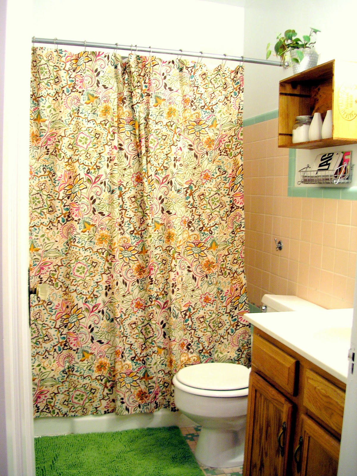
Oh, my bathroom. The little, narrow, poorly designed place I absolutely hate but secretly love all at the same time. Word from the wise: light pink + sage green = absolutely hideous.

At first I thought the best plan of attack was to temper the horrendous color palette with white. The more white the better. White rug, white shower curtain, white, white, white.

Then I came to the realization that I had a dog, with black hair, that liked to shed, shed, shed. Paired with the fact that the space ended up looking more washed out than crispy clean, out went that idea and I was on to something else.


To work with the colors, I ended up pretending the choices were good ones by focusing on the hue vs. the actual shade. I added brighter, saturated, more modern versions of the pink and green, making the space feel warm, cozy and almost fresh. Slowly but surely, the tile started to look more like a plan and less like an eye sore. And with the final additions of busy pattern and lumpy fabric, I think I might just like being in there.

Except when my stomach hurts.

Then it's always bad.


Here are some beautifully photographed afters (thank you, Centsational Girl) to feast your eyes on. Yes, it's definitely not my dream bathroom, but I think it came together as best it could in the end. Highlights include:


[pattern and texture]

[basket of reading material AKA my dad's favorite part of the space]


[refocusing the attention to brighter, prettier accessories]


shopping list:*
$21 shower curtain from Target
$5 wine crate from The Wine Merchant
$2 plant from Meijer
$3 pot from Goodwill
$13 rug from Ikea
$2 basket from Ikea

*everything else was found and collected from my own personal stash of junk treasure.

Thursday, October 14, 2010

Give me glamour, flash.

Let's face it ladies (and some gents), we all enjoy a little bit of glitz and glamour in our lives. From our clothes to our homes, we all own something that screams "look at me darling, I'm gorgeous". Lush fabrics. Mirrored accents. Intricate detailing. When it comes to showing off that glamourous side, it's all about the statement.

Hollywood Regency is a style dating way back to the 1930s when stars such as Greta Garbo, Clark Gable and Mae West ruled the silver screen. These big stars required big style and were able to achieve this through the interior designs created by designers such as William Haines and Dorothy Draper.

left to right: The Greenbrier lobby (Draper), Draper Room, Joan Crawford home (Haines)


To modernize the style, designers like Kelly Wearstler  and Ian Schrager took the unexpected glitz and glamour and paired with a variety of different eras. Enter Modern Glamour. A style that I personally am obsessed with because it takes the statement-making tone of Hollywood Regency and blends with the more casual needs of everyday living.

left to right: Bergdorf Goodman restaurant (Wearstler), Gramercy Park Hotel (Schrager), Viceroy in Santa Monica (Wearstler)


Understanding that these rooms still may still be more on the statement-making side of design, here are some ideas of things that you can infuse into your space to add that glitz and that glam we all drool over. The key to making this look successful? Arrange the room around the way people should interact in it and dress with unexpected surprises to the eye.


FAKE IT: If you don't have an extra $400 lying around, look around your space for a piece of plain furniture that could use sprucing up. Cover the top in mirrored tiles or paint it a deep hue and paint rectangles and squares outlining the piece like this piece I made here. Or, check out your local thrift store and look for ornate objects you can spray paint a bright color for that added "pop".

Sunday, September 26, 2010

Find your inner coziness.

It actually feels like fall today. The air is crisp, the breeze is cool and I didn't need to run the A/C last night. Fall happens to be my favorite time of the year because along with the obvious (leaves, nice weather, new fashion) it's the time where you start bring out the blankets and cozy-ing up your home. The easiest way to do this is by adding softer textures to your space - whether it's through a blanket, sweater pillow or even a faux sheepskin rug. Take a look around your home and see what you already have that gives off that can't-wait-to-curl-up-with feeling. Then, assess what you may be missing - there should be 3-5 things (depending on size) placed throughout the room to introduce the new texture while still keeping the room looking balanced. Find cozy pieces in lighter colors to keep the room looking bright and accentuate the added texture.

Note: If you aren't a furry, fuzzy kind of person, focus more on adding warmer colors and layering patterns and solids. Also, introducing darker wooden accessories can help warm up a space just the same. The colors I've been gravitating toward recently include deep purples, olive greens and mustard.

Here are some of my faves to help start your search.


MAKE IT: Have a sweater you love but can't wear anymore? Or a sweater that has a pretty pattern - for a blanket. Then make it one! Or at least a pillow. Turn the sweater inside out and place the pillow inside. Pin the side and sew three sides (excluding the bottom hem of the sweater). Trim the three sides and place the pillow back in the sweater. Then, hand stitch the top of the pillow, for an interesting detail, create a flap with the left over bottom and secure with some buttons, ribbon or fringe. Also, try experimenting with an old cardigan - change out the buttons or add some felt flowers for added color and dimension.


Friday, July 2, 2010

Consider this living room feng shui-ed.

So this is what I ended up going with. I decided to add a bookcase (compliments of my mother) next to the entertainment unit to keep from floating. I am also planning to hang a couple of shelves to box in the TV and make the separate pieces look more like a unit. Putting the bookcase next to the door will also create a little entryway, which is important as mentioned in an earlier post. I actually ended up removing a side table am planning on adding another lamp to create more light. The current placement of artwork needs tweaking based on the new furniture positioning but all in all, I am pretty happy with the new arrangement. The color palette I'm moving forward with is green (harmony, beginnings, growth, healing), yellow (optimism, communication, inspiration, focus) and either orange (enthusiasm, joy, interaction, fun) or navy blue (imagination, calm, relaxation, serenity) depending on the patterns I find to accessorize with. I'll take a final picture once I complete the decor (should be by Friday, next week).

Wednesday, June 30, 2010

Oh rug, where art thou?

Still on the thought of rugs and continuing to not want to dive into my inner feng shui, I decided to do some research on what's out there. Typically, a rug can serve three main purposes:

  1. wiping your feet
  2. protect wood flooring
  3. add some texture to a room

In my opinion, the most important purpose of a rug however, is to add some pattern. If you're going to fork over the big bucks, pick something that can breathe a little life into a room. The trick is to pick a rug that doesn't overpower a room but adds a little special... something. Here are some great options from the land o' Target (AKA the store within my price range). For the record, I think it's important to purchase a new rug because you should always want to walk in your own footsteps.

Side note: I went to Ikea today and was sincerely unimpressed. Usually a fan of their patterns and textiles, I feel as though I've seen everything before. If and when they do get some new textiles that are versatile enough, I will go back again. But rest assured, I will definitely check out the website before making that kind of venture again. In my opinion, Target is by far the winner in terms of price and diversity.


Friday, June 4, 2010

Give me some of that 90210 style.


I am currently working through the entire 90210 series and have become obsessed with it. As soon as I get a disc from Netflix, I immediately pop it in and watch from start to finish. I loved the show when I was little, but now, I love love love it. 

Anyway, I am at the point in the show where there has been some turnover in the gang. Brenda is going to school in Paris, Valerie moved into Brenda's room, something about a Task Force, etc. Despite all of the recent cast changes, transitioning from high school to college and other miscellaneous drug stints, eating disorders and crazy parents, there is one thing in the show that's been consistent... The Peach Pit. Then I got to thinking that the 50's diner motif has some pretty high points perfect for adding a little historic flare to a room, as long as it's not overdone. Check out local flea markets, craigslist and even etsy for some signature pieces. Here are some of my faves.