logo, photography and styling by Corrin Acome
photography and styling by change of scenery
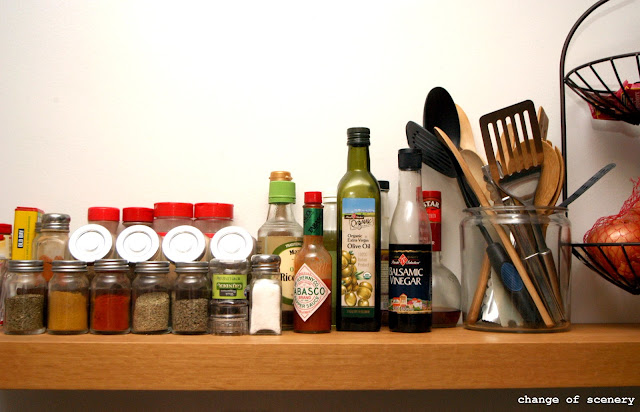
tip: I can't believe I'm saying this but ... embrace "white space". Not every single corner of every single space needs to be occupied. This draws the eye in toward the subject and creates a natural landscape that makes compositions so interesting.
For more styling goodness, check it.


No comments:
Post a Comment