Showing posts with label style by emily henderson. Show all posts

Wednesday, November 9, 2011

rooms i'd like to live in.

I am so entranced in this imaginary dollhouse world that I can't help but day dream about dream houses (or in my case, apartments). ALL. DAY. LONG. So as an attempt to combat this gray, rainy day with thoughts of princess castles and marshmallows, here are some rooms I've been collecting (pinterest again, duh) that make me want to do a happy dance.

And don't worry, if you like it too we can just live there together. Sharing is caring.

Enjoy!
a perfect mix of cluttered chaos. the patterns and teal and books keep it cozy.
the white fireplace and chandy keep this room from looking too chaotic.

if this was the guest bedroom I got to hang out in when i visited,
I would be visiting a lot more often.

love the candles, love the caddy, love the chair. a fantastic little retreat to relax in.

this makes me want to read day in and day out. the HUGE window is outrageous,
the patterns lived-in and the book shelf loaded. I hope it's of James Patterson -
because then I'd never leave!

this outdoor area is unreal. not sure how everything stays dry and clean but,
since I'm technically in the land of make believe, I will ignore any questions regarding functionality.

I love the wood accents and the yellow couch.
I don't know why but it makes me want to sip wine, listen to music and gossip all night.

ok, I really need to do this. it's cute, it's functional, it just needs to happen.
maybe on my bookcase in the living room?

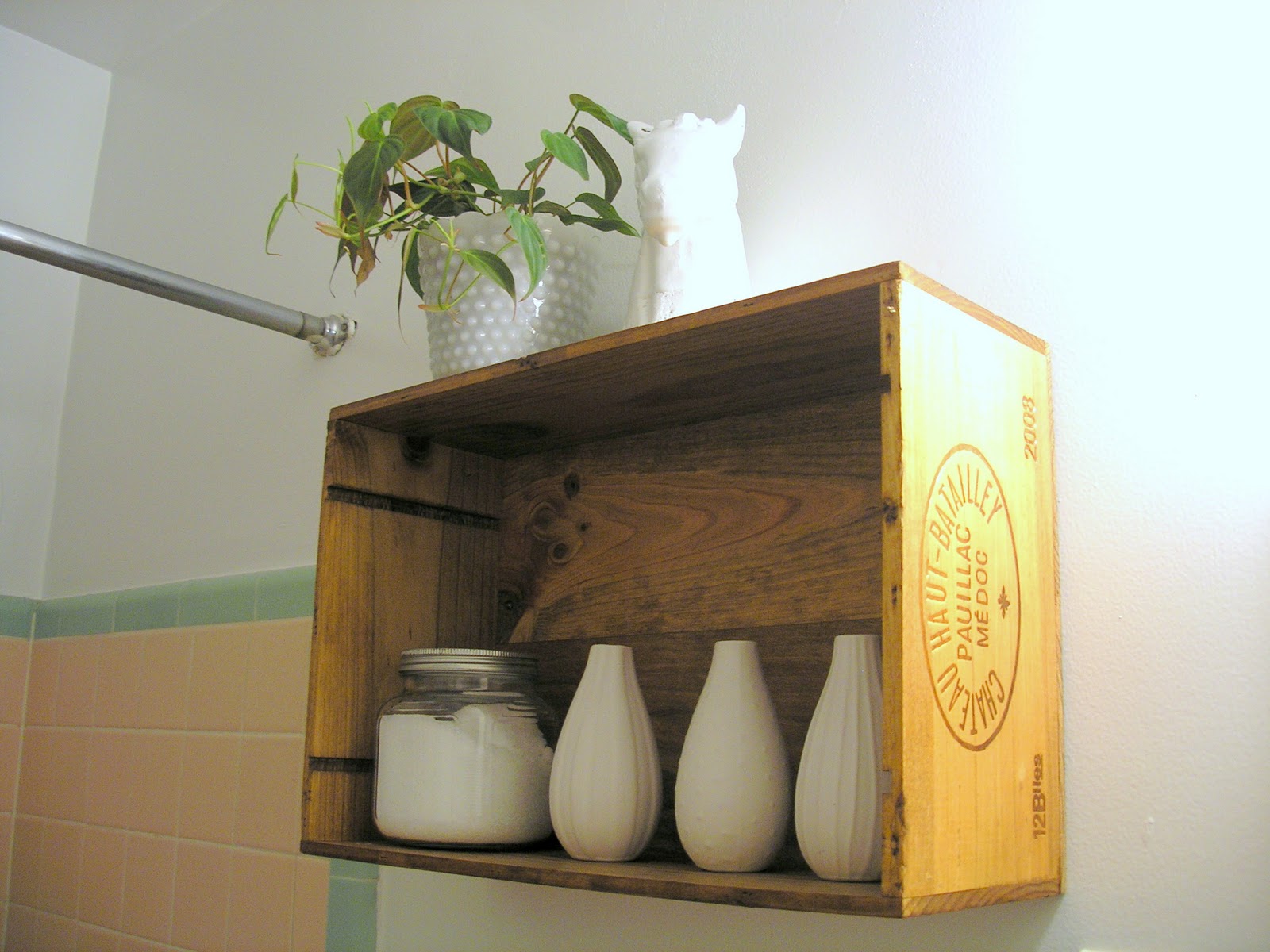
this is another must do - although I feel like it's mocking me right now.
Sadly, I finally had to put the little Ikea palm tree plant to rest. Plants: 0 - Kate: 1
RIP little guy.

this is Ellen Pompeo's kitchen that I have been in love with ever since it was
featured in Elle Decor. The open cabinetry, the super-size fridge, the georgous
picture, the giant stove for me Jim to cook on... sigh.

I absolutely love bathrooms or kitchens that have regular furniture in them
vs. the sterile, waterproof, kitchen- or bath-only pieces we so
regularly see. This bowl sink and vintage dresser vanity make me want to hug someone.

this is the cutest kid's painting / family wall I've seen yet.
Filled with black and white, old photos and finger paint masterpieces,
I think I would stare at it nonstop.

Thursday, September 8, 2011

Wine crate shelf, complete.

Remember a couple days ago when I mentioned wanting to make a wine crate shelf for my bathroom (full post here)? Well, it's finished! And it's cute! And I can't wait to figure out what's actually going to go in it!


Can you tell how excited I am about it by my excessive use of exclamation marks?!?!


To recap for everyone, my rental has a very ugly bathroom with a very ugly vanity. It's large. It's boring. It's absolutely fugly.


First things first, I needed to balance out that bulk. And what better way to balance bulk than by enclosed shelving? Enter the $5 wine crate from The Wine Merchant.

NOTE: Excuse the crappy side angle photo - I remembered to photograph the progress only after I started to stain. D'oh!


I stained the crate with some $2 Ace-brand wood stain in Early American. It was my first time using the stain and I have to say I was rather pleased with it. The color went on really smoothly and the smell wasn't too too bad. I finished it off with some high-gloss polyurethane I had left over from another project and the up on the wall it went.


Here it is styled a bit from random chotchkies I had lying around my house. I'm not completely sold on the accessories but am definitely digging the all-white mix of modern and vintage pieces to really make a statement. Emily Henderson made a comment on her blog the other day about choosing to go eclectic by color or by style so as not to overdo it. I am definitely taking the direction to heart and plan to attempt eclectic by style in this here display.

TIP: Drill holes in the wine crate before attempting to mount it to the wall. I did this and completed the very technical exercise of balancing a level on top of the wine crate, pencilling in the holes to the wall and then looking through the little hole to match everything up. Soooo helpful.


Knowing me, I may add just a splash of color (something bright) based on what I find at the thrift stores but I want to keep it simple enough so it doesn't look like just a bunch of crap shoved up above the john. Right now I'm on the hunt for more white washcloths, a textured, ornate candy dish to use as a pot and a larger fern to go inside. I might add a metal basket to hang right underneath the shelf to hold some reading material for.. you know... when you need reading material.
As far as the rest of the bathroom? I have some ideas but none that seem to be tying everything together just yet. I'm thinking I need to keep down the textured-yet-simplistic look to balance out the green and pink tile.


UPDATED WITH ACCESSORIES:


Wednesday, August 10, 2011

Purple rain, purple rain.

Today's color inspiration is purple. Eek!

It. Is. Terrifying. Too dark and you live in a cave. Too light and you live in a 5 year old's bedroom. And even if you think you've balanced it just right, you still run the risk of it being too girly, causing boys to vanish completely.

Still, nothing says regal, poised and polished like a dose of eggplant. Or lilac. Or aubergine.

So how do you do it? How do you make your room look like a place to unwind with a cocktail vs. an imaginary tea party? With extreme caution, that's how.

You want tips? You want advice? Well, I have none. Because even I'm too nervous to take the plunge. Because the color is just that scary. But what I can do is show you some pretty handsome rooms that even I wouldn't mind having in my own home. That is, if I can overcome the fear.

The sheer window treatment lets light in without opting for a bare window.
Good balance of light and dark tones.

Almost used as a neutral here.
Lots of taupe and gray to counteract with the rich hue.

Again with the neutrals and I'm seeing a pattern of white furniture pairings.
The natural elements of the room compliment the saturated color of the sofa.
Plus, the tufting makes purple (or navy) an obvious color choice.

I heart this room. Especially all of the dog pictures.
For grownups, the menagerie of pictures help break up the bright wall.
I'd pair with a white, iron bed to keep more sophisticated.
And maybe vary the picture theme.

Totally works here as an accent. And very inviting - even for boys.
The bright color, opposite on the color wheel helps balance.

More of a gray tone works as a neutral.
Animated accessories help distribute focus.
Actually, really liking the wall color.

Love the pairing with warm wood tones.
The matte finish helps keep subdued.

The large window helps keep the room looking light.
Minimal accessories with lots of white balance dark tones.