Showing posts with label bathroom. Show all posts

Thursday, September 26, 2013

the un-bathroom vanity.


This post reminded me I need to invest in finding more online stores to browse from. Until then, Restoration Hardware and Urban Outfitters did the heavy lifting. For this look, I wanted to create a tranquil and peaceful vibe, mixing rich wood and metals with stark white and vibrant color. I'm never interested in typical bathroom furniture and accessories so I went with ones that could be used in other parts of a home outside the bathroom. It keeps the space from feeling too slick, overly coordinated and sterile.

tip: If you're short on cash, try looking for a buffet or short dresser to convert into a bathroom vanity. Cut a hole for the sink and add a counter top to create visual interest that's unique and inviting.

Sunday, November 25, 2012

bathroom adjustments.

I've been going back and forth on which route to take for the bathroom for what feels like a century. With icy blue walls and creamy beige tile (thank you tasteful landlords) the space was a completely blank canvas. Girly and feminine? Cozy and plush? Modern and sleek? I couldn't for the life of me choose a direction. 

Finally, while at Target, I found the rug of my dreams. It was rustic, fresh and exactly what I wanted. Since then, I've we've added some frames and an old wine crate to the walls - trying to continue the balance between rustic and fresh. I'm still not 100% on the shower curtain (I think the space needs another, more subtle pattern) but haven't been able to pull the trigger just yet. I also don't think I've found the exact balance I'm looking for in terms of accessories, but I'm happy with how the space is coming together. 


The key to your bathroom looking eclectic vs. a rough hot mess is to 1) find artwork with a cohesive color palette, 2) combine multiple textures throughout the space and 3) mix vintage with modern accessories. This will make the design feel connected, full of depth and well-collected over time. 

Here are some other examples for more ideas. 

artwork: society6 / toothbrush holder: west elm / bath mat: target / shower curtain: target


artwork: society6 / tumbler: west elm / bath mat: urban outfitters / shower curtain: ikea*
* I think this might be the winner for our bathroom


 artwork: society6 / tumbler: ikea / bath mat: urban outfitters / shower curtain: target


 artwork: society6 / tumbler: target / bath mat: west elm / shower curtain: target


artwork: society6 / tumbler: west elm / bath mat: west elm / shower curtain: ikea

Wednesday, October 12, 2011

the little bathroom that could: revamp

Oh, my bathroom. The little, narrow, poorly designed place I absolutely hate but secretly love all at the same time. Word from the wise: light pink + sage green = absolutely hideous.

At first I thought the best plan of attack was to temper the horrendous color palette with white. The more white the better. White rug, white shower curtain, white, white, white.

Then I came to the realization that I had a dog, with black hair, that liked to shed, shed, shed. Paired with the fact that the space ended up looking more washed out than crispy clean, out went that idea and I was on to something else.


To work with the colors, I ended up pretending the choices were good ones by focusing on the hue vs. the actual shade. I added brighter, saturated, more modern versions of the pink and green, making the space feel warm, cozy and almost fresh. Slowly but surely, the tile started to look more like a plan and less like an eye sore. And with the final additions of busy pattern and lumpy fabric, I think I might just like being in there.

Except when my stomach hurts.

Then it's always bad.


Here are some beautifully photographed afters (thank you, Centsational Girl) to feast your eyes on. Yes, it's definitely not my dream bathroom, but I think it came together as best it could in the end. Highlights include:


[pattern and texture]

[basket of reading material AKA my dad's favorite part of the space]


[refocusing the attention to brighter, prettier accessories]


shopping list:*
$21 shower curtain from Target
$5 wine crate from The Wine Merchant
$2 plant from Meijer
$3 pot from Goodwill
$13 rug from Ikea
$2 basket from Ikea

*everything else was found and collected from my own personal stash of junk treasure.

Monday, September 12, 2011

How to: silhouette bathroom artwork

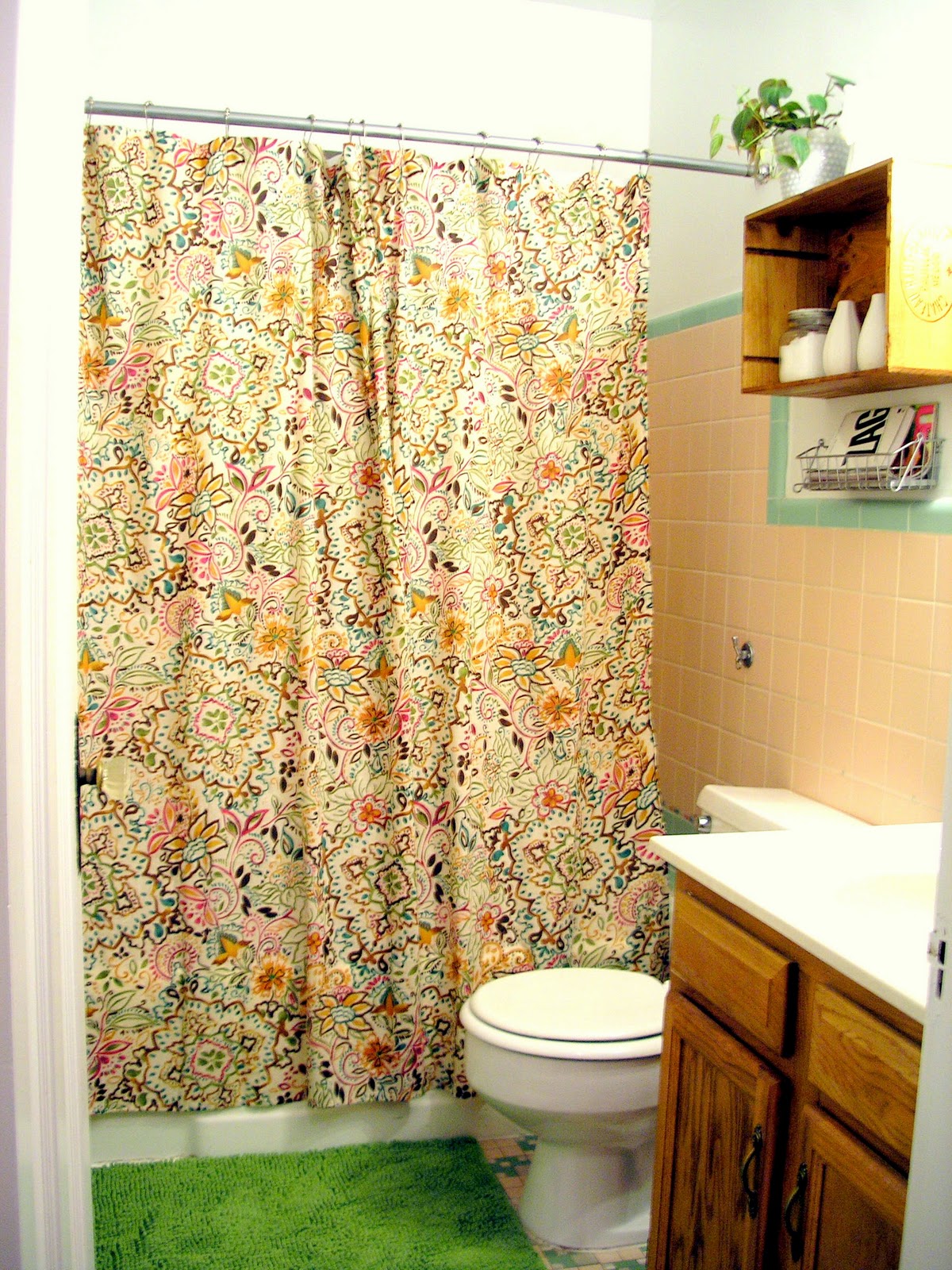
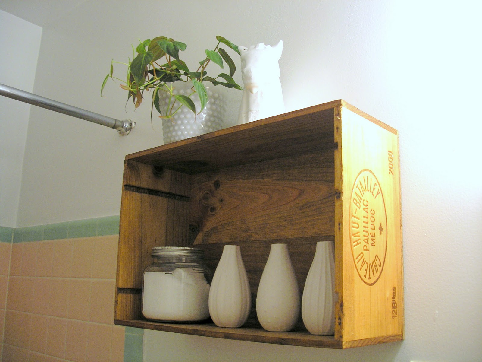
Brace yourselves. I went a little risque with my bathroom artwork. I felt like I could because the bathroom started looking all pulled together and polished with the wine crate shelf (post here). The added white accessories balanced the drab, ugly tile and lightened up the bulkiness of the wine crate and chunky vanity. I'm still fiddling around with which accessories to display but I plan to mix modern and vintage for an eclectic look with an updated feel. But more on that later.

On the opposite wall, I wanted to hang some larger artwork that mimicked the simplicity of the wine crate and white accessories but added a little humor and unexpectedness. It needed to be water-resistant, couldn't compete with the wine crate shelf display and incorporate a pop of color.

So what did I come up with?


That's right, a silhouette of my dog taking a dump! 

It's weird I know, but for some reason I this it's hilarious the way a dog proudly sits back into a good lean to take a #2. They always seem so uncomfortable and awkward and I can't help but chuckle every time I see one get into the position. Then, while waiting the 10 minutes for Ruby to eventually pick her perfect spot, I got to thinking about how awesome a silhouette of the goofy pose would look in my bathroom. 

So, I putting my pride aside and creepily followed Ruby around the front lawn with my phone waiting for her to do the deed. Then I snapped a million different photos hoping and praying I got one that was usable. Fortunately, a snagged this one. She was so embarrassed.


Next, I grabbed my sketch pad and drew the outline of my little furry roommate so it was large enough to fill the spare 18"x24" canvas I had laying around. I cut out the sketch, traced it on the canvas and mixed the perfect shade of hot pink to fill in the outline.


For the record, I was debating on whether to go hot pink or deep teal. To help make the choice, I decided to pick the shade based on the tile color I hated the most in hopes that it would draw attention away. Obviously, the pink won. 


Overall, I'm really happy with the choice. I think it looks modern, brightens up the space and compliments the wine crate and accessories nicely. Plus it's funny, another way to embarrass my dog and something that, yet again, reminds me not to take anything too seriously.

Next up: dialing up the fabrics. Since the white walls are Ã¼ber stark and the tile is Ã¼ber ugly, my goal is to use texture and color to help blend everything together in a way that makes the bathroom decor seem as cohesive and as pretty as it can be.

Exposed brick makes me smile.

I've been crushing hard on rooms with exposed brick since, well, ever. But after searching for inspirational pics during the bedroom redo extravaganza (which I'm changing up AGAIN btw), the crush grew even larger than I'd ever imagined. So much so that I think I'm going to make it a requirement the next time I'm on the apartment hunt. Along with a porch, good water pressure and a claw foot tub.

And let me just tell you, fantasizing about things that you don't have, really helps get things done and find solutions for the things you are working with. In other words, apartment redecorating project, you are put on hold again.

Almost used as an accent wall to break up the white on white in this bedroom.
Natural wood side table used to balance the exposed brick on the opposite side.

This is my absolute DREAM bedroom.
The worn white paint and loads 'o pattern makes my heart go pitter patter.

Painted white in the bedroom makes it more subtle but still enough of a statement. 
Requires little artwork for depth and visual interest for the brick wall to still pop.

I love how they used the exposed brick wall as a backdrop for artwork and book collection.
Creates a raw composition that makes the living room feature a bit more casual.

Love the juxtaposition of modern bathroom accessories and fixtures with an old, chipped brick wall.
Adds depth to the space without it looking old, out of date or drab. 

Having brick in an entryway sets a casual tone for the rest of the home.
Not too excited about the wood to tile cutoff on the floor but the brick does a nice job at keeping the eye upward.

This kitchen makes me want to learn how to cook.
The white keeps the kitchen looking pristine and the window set in the brick helps let light in and offers great reflection.

The painted white in this kitchen capitalizes on the brick's texture but keeps the space looking fresh and clean.
Minimal accessories add a modern yet functional touch.

Thursday, September 8, 2011

Wine crate shelf, complete.

Remember a couple days ago when I mentioned wanting to make a wine crate shelf for my bathroom (full post here)? Well, it's finished! And it's cute! And I can't wait to figure out what's actually going to go in it!


Can you tell how excited I am about it by my excessive use of exclamation marks?!?!


To recap for everyone, my rental has a very ugly bathroom with a very ugly vanity. It's large. It's boring. It's absolutely fugly.


First things first, I needed to balance out that bulk. And what better way to balance bulk than by enclosed shelving? Enter the $5 wine crate from The Wine Merchant.

NOTE: Excuse the crappy side angle photo - I remembered to photograph the progress only after I started to stain. D'oh!


I stained the crate with some $2 Ace-brand wood stain in Early American. It was my first time using the stain and I have to say I was rather pleased with it. The color went on really smoothly and the smell wasn't too too bad. I finished it off with some high-gloss polyurethane I had left over from another project and the up on the wall it went.


Here it is styled a bit from random chotchkies I had lying around my house. I'm not completely sold on the accessories but am definitely digging the all-white mix of modern and vintage pieces to really make a statement. Emily Henderson made a comment on her blog the other day about choosing to go eclectic by color or by style so as not to overdo it. I am definitely taking the direction to heart and plan to attempt eclectic by style in this here display.

TIP: Drill holes in the wine crate before attempting to mount it to the wall. I did this and completed the very technical exercise of balancing a level on top of the wine crate, pencilling in the holes to the wall and then looking through the little hole to match everything up. Soooo helpful.


Knowing me, I may add just a splash of color (something bright) based on what I find at the thrift stores but I want to keep it simple enough so it doesn't look like just a bunch of crap shoved up above the john. Right now I'm on the hunt for more white washcloths, a textured, ornate candy dish to use as a pot and a larger fern to go inside. I might add a metal basket to hang right underneath the shelf to hold some reading material for.. you know... when you need reading material.
As far as the rest of the bathroom? I have some ideas but none that seem to be tying everything together just yet. I'm thinking I need to keep down the textured-yet-simplistic look to balance out the green and pink tile.


UPDATED WITH ACCESSORIES:


Tuesday, September 6, 2011

A wine crate kind of bathroom.

Since I got absolutely ZERO done this weekend, I decided to show you a couple of hints as to what my next project is. In case you forgot, my bathroom looks like this (and is posted about here):


Gross, right? And, since I'm renting, I don't have a ton of options around the old pink and green tile. So instead, I'm forced to try and "make it work" (thank you, Tim Gunn) by adding some artwork and other forms of texture to help liven up the color and overall visual interest of the space.

The first mission is to try and balance out the behemoth of a vanity I've been blessed with. To do this, I'm looking to add some wood accents which will at the same time add texture and warm tones to the tiny space. Stealing the idea from my BFF, Jen, I marched straight over to The Wine Merchant and bought a wine crate for $5. The plan is to stain and hang the crate over the toilet, creating a boxy shelf, adding bulk, height and WOOD to the space. Plus then I can add some cute accessories and hopefully give this guy a little fresh air (pun intended).

But, since I haven't completed it yet, I don't have any after pics showing the crazy transformation that will just blow your socks off. Instead, I've got some good old-fashioned inspirational pics of other ways you can use a wine crate in your home. Plus a couple of pics I used to get an idea of how I should accessorize.

At $5 a crate, I'd say this idea is definitely something worth looking into.