Showing posts with label stencil. Show all posts

Tuesday, July 26, 2011

The secret project progress unveiled.

I can finally reveal some of the progress made on the secret project I've been working on over the past few weeks. While it's not finished-finished, I thought I'd share my five favorites of the space to-date along with some insight into the looming checklist (read: my favorite part) that still needs to be completed. 

But first, a HUGE thanks to the Schullers for being patient, taking some chances and getting their hands dirty.


SIDE NOTE: My apologies for the poor photos. I'm hoping to take better ones as soon as I remember to bring my real camera. And maybe get some photography lessons from my other BFF, Michelle. And maybe get a new camera.


#1: The sitting room stencil work. 
 
I am officially IN LOVE with this room. Yes, it was the room with the most challenges (featured here and here), but I think that's why I'm most proud of it. With the room being smaller, narrow and filled with windows and doorways, it was just screaming for something to tie it all together. Meaning, the room needed something to make it feel more like a room and less like another hallway to the kitchen. To do this, we chose a taupey color (Benjamin Moore's Cedar Keys) to accent a pillow choice and the same white that the kitchen was painted in (Benjamin Moore's Simply White). While I second-guessed it at first (no idea why), all four walls were stenciled (with option 6), bringing the entire room together and making it a prominent eye-catcher as soon as you entered the house.

With the new floor plan, 5" white baseboards, some strategic bookshelf accessorizing, a wall shelf display and (maybe) a new light fixture, it's going to be the sitting room of all sitting rooms.


#2: The vaulted morning room ceiling.

Ok, so I didn't exactly love climbing up the ladder to actually paint the space BUT I did love that the vaulted ceilings allowed for a more dramatic wall color without closing in the space. For this we chose a bright blue (Benjamin Moore's Lakeside Cabin) that complemented the new wood floors and the family's already-owned bright white kitchen table and leather chairs.

Some simple artwork, a refinishing project for the already-owned chest (still TBD), a new light fixture (still TBD) and some minimal table accessories will complete the look.

Oh, and removing the kitchen stove and refrigerator. That'll help a little too.


#3: Dave's mad carpentry skills*.
 *with special thanks to Barry the Sander (get it?)

As mentioned in an earlier post, it's always best to keep the number of focal points in a room to one. So, to do this, we needed to combine both the fireplace and the entertainment center onto one wall (previously split into two). This required some handy work I was definitely not up but Dave graciously took on.

The walls were painted a warmer dark-but-not-too-dark gray (I can't remember the name right now) that brought out the richness of the new wood flooring and brought the whole downstairs together. The hallway was also painted this color to encourage continuity and create a sense of flow throughout the space.

The end result? A susinct focal point that will soon include some shorter Billys (also loved by Go Haus Go), a photo display and some accessorizing. An added bonus? A whole extra wall to place seating along and absolutely zero glare on the TV from the windows.


#4: The striped bathroom.
Mentioned in an earlier post (complete with how-to), I am very fond of little, tiny bathrooms filled with busy patterns and bright colors. So, when I saw that the Schullers downstairs came complete with a teeny, tiny bathroom I got really excited. We chose some bright aquas (Benjamin Moore's Florida Keys and Waterfall) and decided to give the space some vertical stripes, making it seem bigger and brighter.

Keeping the same fixtures in the space and adding a small amount of artwork will finish the look.

#5: The soon-to-be modern-yet-classic kitchen.
Now this is the spot I consider to be the most in-progress. First, we blank slated the kitchen by painting it white (Benjamin Moore's Simply White). This was vital to the downstairs design as the kitchen is the center point between all three rooms (morning, family and sitting room). This allowed us to break up the monotony by painting the other rooms three different colors without making the space feel too disconnected.

So what's next? A subway or glass tile (still TBD) back splash, some brushed nickel cabinet knobs, brushed nickel drawer pulls and eventual addition of an L-shaped island/breakfast bar that will (hopefully) be painted a complementary blue to the morning room, further connecting the two spaces.

I know what you're thinking. The cabinets could be painted to further modernize the space. However, 1) I kind of like the contrast between the dark floor and light cabinet finish and 2) I think the knobs and pulls will modernize them enough to look updated, especially with a new back splash and (eventual) painted L-shaped island/breakfast bar.

And thereyouhaveit! That's the top secret project mentioned in some previous posts and the latest thing I dove head first into. I hope that the Schullers are equally as happy with the space and can't wait for the next part of the project... accessorizing.

Oh, and my favorite part, making the final to-do/buy checklist which is already in progress because I couldn't wait any longer to start making.

Thursday, July 7, 2011

Getting my stencil on.

Sitting room resolved! After confirming that the "piano" I thought I saw was actually a desk with one of those white wire shelves on top (pictured here - soooo embarrassing), we opted for a floorplan that created a sitting area great for making small talk or reading a good book. The chaise was a little bigger than I originally had the plans but I think the two bookcases will help soften the edges that don't exactly fit within the bay window.

NOTE: The bare wall in the bottom righthand corner will be used to display floating shelves, kid's artwork and some additional accessories currently TBD.


Now for the fun stuff! Since majority of the walls are either comprised of large floor-to-ceiling windows, bookshelves or a floating shelf and picture arrangement, it's not too huge of a risk to incorporate pattern on not one, not two, but all four of the walls. I know awesome, right?

To do this, I'm choosing to use an all-over wall stencil (also seen here in Jen's house) because I  1) can't stand the seams you get with wallpaper, 2) feel like I have more control over color choices and 3) like stenciling WAY more than wallpapering.

The pattern will need to be a lighter monochromatic in palette, larger in size and well defined to:
  • prevent the smaller space from seeming too closed in
  • play off the symmetry that's now been added to the space
  • avoid looking too busy and overly decorated
I have all the colors narrowed down to Simply White (Benjamin Moore) and a soon-to-be-determined khaki color also in one of the pillows chosen for the space (great job, Chris!).

That leaves the stencil pattern still TBD. Now, I've "narrowed" it down with an etsy search to 9 different choices but am having trouble condensing any further before talking things through with the homeowners. Here's where I'm at, in no particular order:

option 1: taller pattern adding height, more open pattern,
blances boxiness of the chairs and bookshelves

option 2: very geometric, smaller pattern,
a little more neutral in terms of shape

option 3: very regal looking, a little more formal

option 4: adding new shape to the room

option 5: compliments chair form,
curved edges play to chaise headrest, more open pattern

option 6: complimentary pattern to all furniture styles, a little more floral

option 7: more depth to pattern, same complimentary shape

option 8: adds tons of texture, gives balance between two wall colors,

option 9: much larger design, larger gap in pattern, mimics dots on pillows


I can honestly say I have no idea which one to recommend. Turns out, with the room balanced in terms of layout and shape, there isn't necessarily a need for one type of pattern over the other. I think the final decision will come down to comfort level, actual contrast in paint color and what the homeowners consider most relaxing or calming. Stay tuned!

Monday, June 13, 2011

Jen & Chad's place: the plan

Much progress was made this weekend on Jen and Chad's living room. Slowly but surely the room is coming together and what is coming together, has been totally worth the wait.

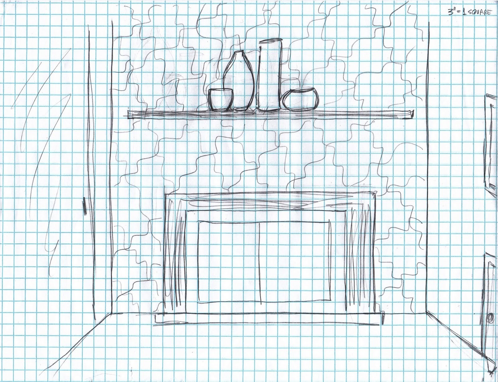
First, the sketches. Here are the simple sketches that I put together based on the back-and-forth on pinterest (listed here) and the overall needs of the space. The sketches are simple and are meant to be used as a guideline for what is needed and what the larger aspects of the decor would look like.

sofa wall: travel photo composition (with the ability to add), long curtains to add height, larger lamp for side table, new patterned pillows

fireplace wall (main focal point): painted wall with stenciled pattern, new more modern shelf (please Chad!), very simple white vase collection

TV wall: new stained TV console, frame bookshelves (see Jen's pinterest), potted plant with stand to break up the squares

the bar wall (wild card): possible wall color, DIY shelves to house wine bottles, etc.


Second, the fabric. The reason for choosing the fabric before the paint colors is because it's more difficult to try and match a fabric with a paint color than vice versa. So, after a cool 4 hours (not exaggerating), we finally found the perfect two (yes, two) pillows that ended up being the inspiration for the rest of the color throughout the room. 


Style & Co. green pillow (@ Macys)

Zenith Pillow (@ Crate and Barrel)

Once we chose the fabric, we spent a total of 20 minutes (including shake time) to pick up two gallons of paint for the fireplace wall. We went with a warm, dark gray (eagle something from Ace) for the primary color and a matching chartreuse green (lone oak something from Ace) with a lattice-like stencil.


We started sanding the TV stand, painted the primary color on the fireplace wall, primed the coffee table and hung the frame composition behind the sofa. All in all, a busy weekend! 

How did we put the rest together and what does the final space look like? Stay tuned!

Tuesday, November 2, 2010

A subtle wall of pattern.

9 times out of 10 people's version of decorating is hanging up pictures. Could be photos of friends. Could be artwork you like. Either way, it's something in a frame... on a wall... by itself or in threes. While that continues to be my go-to way to dress up a wall, I was growing a little bored of the look and wanted something a little different.

The wall that I'm talking about is one that contains a window that houses my air conditioning unit that sits in between the arms of my couch and chair. With my living room being rectangular, the wall seemed awkward being bare yet not large enough to be a statement wall. I needed something subtle. However, typical Kate fashion, I ran into issues.

First, as mentioned in previous posts, I am not allowed to paint/wallpaper/change anything about my walls except for putting tiny holes in them. Second, I already had shelves on the opposite wall so and adding any more seemed like overkill. Finally, with my couch and furniture being relatively plain, my living room was in desperate need of some visual interest but the wall could not compete with other primary focal points.

What did I end up doing? Instead of going back to my college roots and hanging a tapestry across the wall, I opted for hanging twelve 18"x20" canvases in a grid-like pattern with the same stencil. The composition ended up filling up the awkward wall and framing in the random window without being overbearing or shifting too much focus away from the other areas in the space.


To get this look, all you need are:
- 18"x20" canvases (I already had 6 hanging around but packages of 3 can be found at Michaels for $9.99)
- Primer (I use Kilz)
- Large paintbrush to prime
- Two-part stencil (I got mine at Michaels)
- Sponge applier for the stencil
- Silver and bronze acrylic paint tubes
- Clear acrylic spray paint in high gloss (optional)

Prime your canvases to ensure they are all the same color and to prep for painting. Then, lay your first step in stenciling and apply two coats of either silver or bronze paint. Repeat for the second step with the opposite color paint. For a more finished look, spray 2-3 coats of the clear acrylic finish. Then, hang canvases equal distance apart in opposite directions.

Plaid, argyle or any geometric pattern are other interesting takes on this composition. Just remember, the busier and/or colorful the pattern, the more of a focal point the wall will end up being.