Showing posts with label kitchen. Show all posts

Thursday, April 5, 2012

seeing red. the right way.

With today being the Reds AND Indians home openers, I thought it necessary to pay homage to two teams I hold close to my heart. Between my brother being named after Pete Rose, my parents having owned a baseball card store (mmhmm... Gateway Cards) and my brother playing it all his life (he now coaches high school ball in Orlando) I can easily I was born and raised to love the sport. I've met both Manny Ramirez and Charles Nagy (both held signing sessions at my parents store) and my dad even helped Manny find a place when he first moved to Cleveland! I tell you, it's in my blood. Which works out perfectly for my boyfriend who is a Cincinnati Reds DIE HARD.

So what the heck does all of that have to do with anything I post up on here? The color red that's what. A pretty, vibrant color to use as an accent. As long as you know how. Here are some tips to steer you in the right direction.

1. When in doubt, add a chair.
 A simple update like a paintied chair can help break up a neutral palette.


2. Or a hutch.
Painting a piece of furniture red creates a "pop of color" (thank you, mom) regardless of the piece.


3. Or fabric.
I'm not a fan of painting an entire wall red. I think it's because I like to switch things up a lot. So instead, I opt for things like fabric and furniture that you can move in and out of a space depending on the color scheme.


Whatever the accessory, just be sure to keep the color in small doses. The more you use as an accent, the more dramatic the color will look. Happy opening day!!

Wednesday, January 11, 2012

crazy over aqua.

Since I'm still mildly obsessed over Amie's color choice for the nursery (Under the Big Top, Benjamin Moore), I've decided to make aqua into this week's pinterest color inspiration. Sure the paint color wasn't exactly aqua but close enough right?

Aqua is growing up, my friends. It's moved out of the bathroom, away from the fish and beach decor and became a completely viable option for spaces like nurseries, bedrooms, kitchens and even living rooms. What makes this color an up-and-coming contender is its ability to be paired with more sophisticated, saturated colors while still looking fresh and modern. Gone are the days where aqua could only be paired with bright colors like lime, yellow, cornflower and macaroni and cheese (yes, those are all actual colors - grab your Crayolas if you don't believe me). Instead, the color makes its mark when partnered with colors like terra cotta, brick red, midnight blue and even pine green (again, all real colors). Trust me, aqua is the jam.
Now, there are a grillion different ways you can add some aqua into your life. As long as you are familiar with the right proportions and ways to make a statement. Keep reading for two fail-proof ways for making it work. Tim Gunn style.

1. Brighter means smaller.

And by brighter I mean more a more saturated version of the hue. With aqua being such a bold color, it can easily overpower and overwhelm any space. On the flip side, the paler the hue the more ground you can cover. That said, keep the paint colors softer and the accessories bolder.


both images via the lennox


2. Be unexpected when you can.

Aqua is just one of those hues you can't help but notice. It's crisp, bright and screams "hey! over here!" Sure it looks nice on a vase, set of earrings or wall color for that matter but to really make it stand out, test the waters with something a little different. Remember the proportion rule above and make the sky the limit. I am DIGGING painted floors these days (probably because mine are so ugly) and aqua couldn't look more perfect there. The second is a little brighter than I'd go with but you get the idea.


for more photos, check out my pinterest page, cooling down.

Thursday, December 1, 2011

dollhouse furniture and second floor update.

The moment you've all been waiting for. Dim the lights, bring out the drum roll, cue the disco ball! 

Here's the progress on the dollhouse I've been working on for the I'm a Giant Dollhouse Challenge. I'm 80% finished with the bottom right side of the house - I just need to mount the rest of the kitchen shelving and accessorize. 


Note the change in island color. I decided to switch gears and go with a more neutral color palette, accented with bright, fun, jewel-toned colors and metallics. You'll note the new sink faucet (obvs a Chicago Faucet, DAD) and the beginnings of the open shelving for the kitchen. 


 The dining rooms is an eclectic mix of "old" and "new" furniture. I wanted the table to look old and rustic, pairing it with a bold yet classic geometric "rug" and glossy white chairs to balance. The upholstered bench makes the table more casual and adds another layer of pattern to the mix, the similar color scheme tying it all together.

My favorite, favorite, FAVORITE piece I've made so far is the teal campaign-style dresser. It ads an unexpected pop of color and sets the tone for playful accessories and light fixtures. Unfortunately, I couldn't find teeny tiny recessed drawer pulls or t-shaped brass trim but I think the paint job gets the idea across just fine.

I don't know about you but I'm pretty impressed in my carpentry and refinishing skills :)


Last but not least, I made some small tweaks to the upstairs wall colors and started in on the flooring. I toned down the original workspace wall color to more of a butter cream, warming up the room and allowing me to paint the entire room the same color. The bathroom wall color was also toned down, choosing a navy blue with more gray-brown undertones. As you can see, the two choices are way more complimentary of each other. 

The second floor rooms are going to be the same dark hardwood as the first floor although I'm still debating on whether to "tile" the bathroom or not. I hope to finish up the kid's room flooring tonight and make a final decision. 

And that's it! The family room is next on the list and I've got a few purchased pieces (finally!) to refinish for the upstairs. Hopefully I'll have just as much to share next week.

Tuesday, November 15, 2011

the hopeless kitchen.

Tonight I'll be working on the kitchen part of my I'm a Giant Challenge dollhouse. Counter tops and cabinets. The oven and stove. A fridge. The whole nine yards.

Per usual, I only have a half baked idea of what I want. And, since it's the kitchen, the idea's really half baked. Probably burnt on one side and is likely missing a few ingredients. Sigh. Poor kitchen.

For those that don't know me, the max time I spend in my kitchen is about 5 minutes: 1 minute to put my leftovers from [restaurant] in the fridge and the other 4 minutes doing things like ironing, refilling my water cup and grabbing some treats for Miss Ruby.

Needless to say, when it comes to the kitchen, I'm clueless. Thankfully, I've been able to grab some small clues from my culinary student boyfriend, Jim, on what constitutes a functional kitchen. And since my idea of a dream kitchen is one that's housed in a restaurant, I'm hoping to cram together a plan that begs the question, "what would Jim want in his kitchen".

Or maybe I should just scrap the kitchen all together and build in a delivery unit instead. Wish me luck tonight people - I'll definitely be needing it.

prep bar / kitchen island via heirloom philosophy

fireplace for wood grilling (?) via milenachka

open shelving via style files

butcher block counter tops + chalkboard via pinterest

lots of natural and canned light via crap we like

a big huge sink for food prep via flourish design and style

an indoor herb garden via martha stewart

lots 'o counter space via southern living

more open shelving + close seating for conversation while prepping

Monday, September 12, 2011

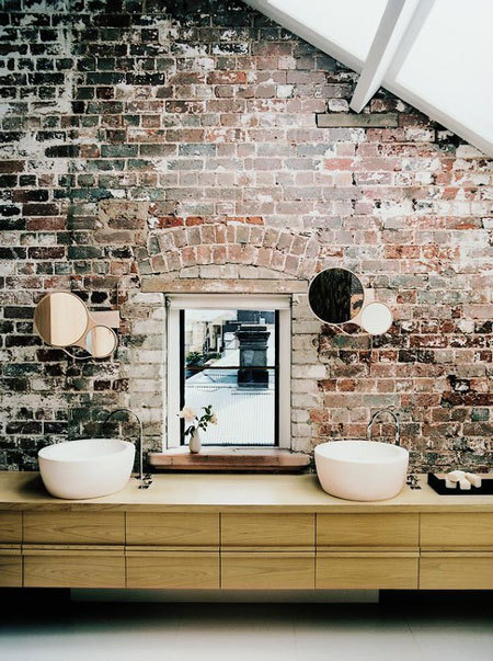
Exposed brick makes me smile.

I've been crushing hard on rooms with exposed brick since, well, ever. But after searching for inspirational pics during the bedroom redo extravaganza (which I'm changing up AGAIN btw), the crush grew even larger than I'd ever imagined. So much so that I think I'm going to make it a requirement the next time I'm on the apartment hunt. Along with a porch, good water pressure and a claw foot tub.

And let me just tell you, fantasizing about things that you don't have, really helps get things done and find solutions for the things you are working with. In other words, apartment redecorating project, you are put on hold again.

Almost used as an accent wall to break up the white on white in this bedroom.
Natural wood side table used to balance the exposed brick on the opposite side.

This is my absolute DREAM bedroom.
The worn white paint and loads 'o pattern makes my heart go pitter patter.

Painted white in the bedroom makes it more subtle but still enough of a statement. 
Requires little artwork for depth and visual interest for the brick wall to still pop.

I love how they used the exposed brick wall as a backdrop for artwork and book collection.
Creates a raw composition that makes the living room feature a bit more casual.

Love the juxtaposition of modern bathroom accessories and fixtures with an old, chipped brick wall.
Adds depth to the space without it looking old, out of date or drab. 

Having brick in an entryway sets a casual tone for the rest of the home.
Not too excited about the wood to tile cutoff on the floor but the brick does a nice job at keeping the eye upward.

This kitchen makes me want to learn how to cook.
The white keeps the kitchen looking pristine and the window set in the brick helps let light in and offers great reflection.

The painted white in this kitchen capitalizes on the brick's texture but keeps the space looking fresh and clean.
Minimal accessories add a modern yet functional touch.

Tuesday, July 26, 2011

The secret project progress unveiled.

I can finally reveal some of the progress made on the secret project I've been working on over the past few weeks. While it's not finished-finished, I thought I'd share my five favorites of the space to-date along with some insight into the looming checklist (read: my favorite part) that still needs to be completed. 

But first, a HUGE thanks to the Schullers for being patient, taking some chances and getting their hands dirty.


SIDE NOTE: My apologies for the poor photos. I'm hoping to take better ones as soon as I remember to bring my real camera. And maybe get some photography lessons from my other BFF, Michelle. And maybe get a new camera.


#1: The sitting room stencil work. 
 
I am officially IN LOVE with this room. Yes, it was the room with the most challenges (featured here and here), but I think that's why I'm most proud of it. With the room being smaller, narrow and filled with windows and doorways, it was just screaming for something to tie it all together. Meaning, the room needed something to make it feel more like a room and less like another hallway to the kitchen. To do this, we chose a taupey color (Benjamin Moore's Cedar Keys) to accent a pillow choice and the same white that the kitchen was painted in (Benjamin Moore's Simply White). While I second-guessed it at first (no idea why), all four walls were stenciled (with option 6), bringing the entire room together and making it a prominent eye-catcher as soon as you entered the house.

With the new floor plan, 5" white baseboards, some strategic bookshelf accessorizing, a wall shelf display and (maybe) a new light fixture, it's going to be the sitting room of all sitting rooms.


#2: The vaulted morning room ceiling.

Ok, so I didn't exactly love climbing up the ladder to actually paint the space BUT I did love that the vaulted ceilings allowed for a more dramatic wall color without closing in the space. For this we chose a bright blue (Benjamin Moore's Lakeside Cabin) that complemented the new wood floors and the family's already-owned bright white kitchen table and leather chairs.

Some simple artwork, a refinishing project for the already-owned chest (still TBD), a new light fixture (still TBD) and some minimal table accessories will complete the look.

Oh, and removing the kitchen stove and refrigerator. That'll help a little too.


#3: Dave's mad carpentry skills*.
 *with special thanks to Barry the Sander (get it?)

As mentioned in an earlier post, it's always best to keep the number of focal points in a room to one. So, to do this, we needed to combine both the fireplace and the entertainment center onto one wall (previously split into two). This required some handy work I was definitely not up but Dave graciously took on.

The walls were painted a warmer dark-but-not-too-dark gray (I can't remember the name right now) that brought out the richness of the new wood flooring and brought the whole downstairs together. The hallway was also painted this color to encourage continuity and create a sense of flow throughout the space.

The end result? A susinct focal point that will soon include some shorter Billys (also loved by Go Haus Go), a photo display and some accessorizing. An added bonus? A whole extra wall to place seating along and absolutely zero glare on the TV from the windows.


#4: The striped bathroom.
Mentioned in an earlier post (complete with how-to), I am very fond of little, tiny bathrooms filled with busy patterns and bright colors. So, when I saw that the Schullers downstairs came complete with a teeny, tiny bathroom I got really excited. We chose some bright aquas (Benjamin Moore's Florida Keys and Waterfall) and decided to give the space some vertical stripes, making it seem bigger and brighter.

Keeping the same fixtures in the space and adding a small amount of artwork will finish the look.

#5: The soon-to-be modern-yet-classic kitchen.
Now this is the spot I consider to be the most in-progress. First, we blank slated the kitchen by painting it white (Benjamin Moore's Simply White). This was vital to the downstairs design as the kitchen is the center point between all three rooms (morning, family and sitting room). This allowed us to break up the monotony by painting the other rooms three different colors without making the space feel too disconnected.

So what's next? A subway or glass tile (still TBD) back splash, some brushed nickel cabinet knobs, brushed nickel drawer pulls and eventual addition of an L-shaped island/breakfast bar that will (hopefully) be painted a complementary blue to the morning room, further connecting the two spaces.

I know what you're thinking. The cabinets could be painted to further modernize the space. However, 1) I kind of like the contrast between the dark floor and light cabinet finish and 2) I think the knobs and pulls will modernize them enough to look updated, especially with a new back splash and (eventual) painted L-shaped island/breakfast bar.

And thereyouhaveit! That's the top secret project mentioned in some previous posts and the latest thing I dove head first into. I hope that the Schullers are equally as happy with the space and can't wait for the next part of the project... accessorizing.

Oh, and my favorite part, making the final to-do/buy checklist which is already in progress because I couldn't wait any longer to start making.