via chris court
via color me carla
So how the heck do you create a gorgeous vignette?
This is what I'm hoping to figure out over the course of this Wednesday series. The goal is to take little areas within my own home, determine what's working and fix what's not.
Now, I'm not trying to discount styling as a profession. In fact, I believe there's a definite art to styling that you either have or you don't. This is why magazines like Real Simple, Elle Decor and House Beautiful have their very own interior stylist(s) for photo shoots. Ladies like Emily Henderson, Clair Wayman, Megan Morton - y'all are my heroes.
Professional career path aside, isn't there a way the you and I's of the world can at least improve upon this talent? Aren't there a few tricks we could use to disguise our lack of expertise?
experiment #1: my jewelry corner
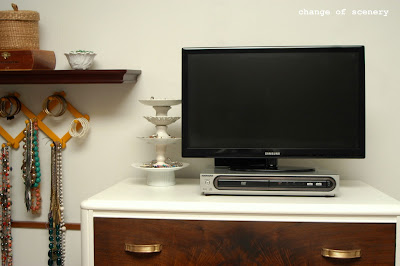
Here's the before. Unbalanced color and proportions, no obvious focal point and a little stagnant.
And the after. I worked on balancing the colors and proportions while at the same time creating a focal point that would move the eye across the entire vignette. Gold was added to the shelf by hanging a small frame which also added some subtle height. I removed the large picture below the hanging jewelry to try add focus. Greenery and wooden accents were added to the dresser to breakup all the white and continue moving the eye across the space. It's a little busy but I kind of like it that way since it's a jewelry corner. Maybe my next challenge will be minimizing accessories.
What does everyone think?


No comments:
Post a Comment