
Aside from family photos, travel memories are the primary reasons why something gets framed and hung. Because of this single point of reason, it becomes really important that we mix different mediums within a display composition so our walls don't become very large scrapbook pages I have to "theme out" based on a place or a geographic area. We also to keep the eclectic vibe and maintain a certain level of visual interest throughout our home.
To keep get this mix without breaking the bank, I have a habit of purchasing greeting cards instead of actual artwork whenever I travel. It offers visual variety, maintains consistent sizing and often provides the perfect snapshot into our travels. My mom actually filled me in on this little secret that, aside from the frame purchase, costs around $5 vs. $50. This means I always, always, ALWAYS spin the greeting card wheel in search of something I can frame. It also helps designate more budget on larger pieces of artwork should I find something catch my eye that doesn't necessarily agree with my wallet.
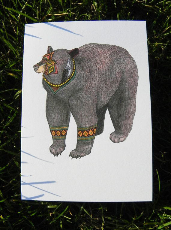
Here's what I've added to my collection as of late - all from our travels to either San Francisco or Napa. Notice that not all are landscapes and some don't even have to do with the actual location. This also helps keep the subject and theme of each wall montage eclectic and, in the case of the unicorn, makes me smile every time I walk past it.

[@ a bookstore on Haight Street]

[at the Artesa Vineyards]

[at a Napa Valley art gallery]

[at a Napa Valley art gallery]
To make sure you pick a greeting card that is frame worthy, keep these tips in mind:
- Avoid anything with a sheen or glossy finish. This will minimize the glare from natural or artificial lighting in your space.
- Put each potential candidate through the "is this a greeting card" filter. If you think it looks like a greeting card in any way, shape or form put it back.
- Push yourself to mix up the medium. This means, take note of the cards you already have and try to find a style you have less of. For example, if you tend to gravitate more toward watercolor, try finding one with more illustrative notes that you like just the same.


No comments:
Post a Comment