Allow me to paint the rage-filled background. While sitting down to enjoy my morning cup of coffee I pulled up this past weekend's Golden Globes gowns, excited to be wowed by the selection and not able to wait another second to soak in the glamourous evening I so love to peruse.
FAIL.
Instead, I was feverishly pressing the next button (over. and over. and OVER.) waiting to find the amazing gowns I know these gals are capable of wearing. Amy, Tina, Natalie, Heidi. NOTHING. While I was able to find a few diamonds in the rough (not exaggerating), majority of the gowns seemed to be overly ruffled, borderline costumey, weirdly sculpted or too boring to get noticed. Am I being overly critical or do these stylists need to step it up a notch? Ugh. Mean Kate, entering here.
1. Natalie. This is not the 1870's, girlfriend. Bussels should forever be a thing of the past or on the set of Pride & Prejudice. While I adore the hot pink, simple makeup and deep red accents, the shape does absolutely nothing for her and is draped around like she should be headed to a toga party.
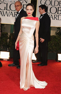
2. Angie. This is actually the exact opposite of Natalie's problem. The shape is completely, 100% perfect for her but the colors makes Ang look sickly. Even though I've always been Team Jen, Angie porcelain skin is something I'm willing to give her mad props for. The issue is that she has a pink undertone which puts pastels and muted colors (with the exception of nudes and beiges) on the do not wear list. I get the whole neutral-with-a-pop-of-bright-color-by-her-face thing but if she wants to go that route Ang needs to go more beige+jewel tone to make it work. Or monochromatic like Natalie's.
3. The Deschanels. This one is painful for me because I love, love, love, LOVE Zooey. But she chose wrong. And so did her sister. They look like they're playing dress up with the wardrobe from Dynasty. I'm liking the bright lime contrast Zooey's sporting and I'm always a fan of the deep blue hue, but come on ladies. Retake your measurements, know what your assets are and show them off.
4. Sarah. Another linen closet original. Lose the tie-dye effect and mushroom top for a version that's more updated, streamlined and fitting. Or, if Buffy wanted to stay bright and colorful, she could have opted for a block-colored, tailored gown with more of an edge. She looks so uncomfortable in this dress she almost looks constipated.
5. Kelly. I appreciate the heavy tailoring, I really do. But the front darts make her look like she has THO, her shoulders are way to broad to pull off those sleeves and someone forgot to steam the bottom half of her dress (which she's too short to be wearing anyway). With platinum hair and an hour glass shape, you need to simplify to keep the gown from overpowering your true shape.
6. Charlize. This gown looks like it's in the midst of an identity crisis between old hollywood glam and a straight up flapper. Trying to do too many things at once, the gown comes off as messy, unfocused and a little costume.
7. Lea. I think she was trying to do a similar thing that Olivia Wilde did in 2009. The issue I have with it is, like Charlize, the gown is trying too hard. The long sleeve, the metallics, the mermaid silhouette... too much, too much, too much. If you're going sheer, balance with an understated color and some layers. This will help the option look more timeless and appropriate vs. flashy and Las Vegas show girl. See the difference?
8. Julianne. It's true, I always appreciate her fashion risks. But for this one she should have picked either long or short. Probably long since she's showing a ton of skin up top. Love the green accessories though.
9. Laura. Again, find your best asset to feature. Clearly, Laura's chest is not the one I would have focused on. And the belt doesn't do anything for her boyish torso. Legs, shoulder or back, Laura. Legs. Shoulders. Back.
10. Reese. I hate to put her on here but I have to. I get the whole "undone" look she was going for but the structured, extremely form fitting dress hugged her in all the wrong places and didn't match what was going on up top - especially the dramatic coloring. It washed out her face and hair, made her look wider in places she's really not and had uneccessary darting in areas no darting should ever be placed. Ever.
The conclusion? COME ON HOLLYWOOD. Get your head back in the game! To really drive home the fact that these dresses were either gross or meh, here are the ONLY FIVE outfits I happened to like. Yes, only five. Have the stylists gone on strike?
1. Kate. Even though it was very Carrie and Aidan, Kate looks ridiculously stunning. Her dark hair and olive-based skin tone keeps the white looking fresh and crisp and her skin looking dewy and glowing.
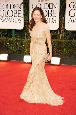
2. Diane. Lea, take note. This is another way to do sheer. The gold compliments her auburn hair and the shape is extremely flattering for her shape. The cinched waist accentuates her curves and the sleeve makes it elegant and age appropriate. Also, the metallic is much more subtle making the gown look light and airy.
3. Emma. Probably my favorite one of the night. Laura, this is how you use a belt to define a boyish torso. The pleats and shoulder sleeves add more curves to her petite frame while the deep v-neck is positioned in a way that shows off her collar bone vs. making her appear bustless.
4. Piper. I love the fullness of the gown paired with the simple color and top. She looks like she's having a blast in this dress which is also a testament that the way you feel in something has everything to do with how it looks on you.
5. Stacy. I really didn't want to like it. Anyone from Dancing with the Stars kind of puts a bad taste in my mouth. But then - sigh - I saw these photos of the gorgeous bow on the back of the dress. The simplicity of the gown really made her figure stand out and diagonally tied bow accentuated her height. Is that a panty line though? Awkward.


No comments:
Post a Comment