
Typically, I'm more of your everyday white, gray and brown girl but ever since the yellow decision for my nightstand (mentioned here) I can't help but want to introduce even more color into my calm, sometimes collected, eclectic pad.
Expanding on the idea of color since my last yellow post, I thought I'd do a week long color series that offers ideas and inspiration for incorporating new hues into your space.
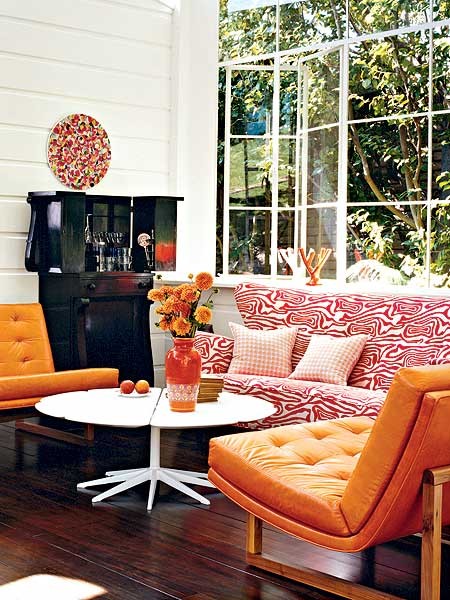
Today's color? orange.
In my opinion, orange is scary because of its ridiculously close connection to 60's home decor. If done wrong, your space could look dated, muddy or like came straight out of the Brady Bunch set. But, if done right, orange can look crisp, vibrant and exciting.
To keep your space from looking more fresh and less groovy:
- contrast with a cooler color like aqua, navy or lilac
- keep in mind the brighter the orange, the less you should use
- try using white or gray as a neutral vs. browns and reds
- opt for wooden legged furniture if the dominant color is orange


No comments:
Post a Comment